At my firm, we were asked to submit design ideas for this small private college in Maryland for an academic building. The site was off campus in a lot they recently acquired, similar to if MSU had a building on 12th and alderson in bozeman. The building is to be 32,000 sqft in a historic residential neighborhood, at the initial meeting, the college stressed they wanted something to be really sustainable, (LEED Platinum) and fit in the residential community, scale/form.
When it came to stylizing the renders I looked at a series of different techniques. Since I only had a few days to work on the design, the building had very little detail, and still a lot to be worked out. This became pretty obvious with photo realistic renders.
As much as I enjoy photo realistic renders, I feel as if you need something more loose for such a concept design, and something that shows the building still needs more refining and design to it.
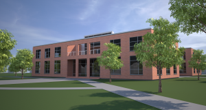
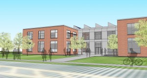
The building was modeled and rendered in sketchup. Above is the maxwell plugin for sketchup, with all custom sketchup materials. The trees were just pulled off 3dWarehouse. I feel sketchup is a good tool for getting that more sketchy look to it. I have struggled to achieve that effect in rhino, even with using the penguin plugin, I was not happy with the output. So going straight out of sketchup I was getting renders like this:
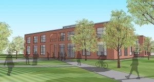
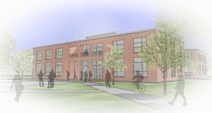
The textured ground is the jpeg I used as the site in sketchup. I traditionally do not like to use renders right out of sketchup, because it is too easy to tell how I came up with that image. Lastly I tried working with some of the different sketchup styles. One I found interesting was PSO vignette. Take a look at the outcome.
I think its a nice effect, that is kind of convincing as far as colored pencil goes. It took no time at all to achieve this effect, just simply toggled a style in SU.
Out of the three styles, what do you think would be most appropriate for this application? What is missing?
(the project was submitted a week ago, and we are waiting on the short list. I also submitted a more ‘traditional’ academic style building not shown here)
Some other images.
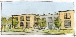
Shitty 10 Min Water Color
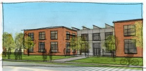
Shitty 10 Min Water Color Overlayed with Sketch up model
I think you could spend a little more time than I did make it a little cleaner and do a bit more photo shop work, but to me this is a fun way of generating a sketchy effect.
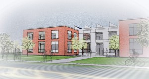
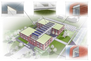
I really love the last image the birds eye diagram, I think everything about that image is spot on, the style works great and the diagram is really clear. (not sure the trees in the paved area courtyard thing would survive). I think this style works great for diagrams, but as for the prospectives, I think they feel a little cold some how, the are almost there, but it still seems like something is missing. Like I said to you on the phone when we talked about it maybe a real deal hand drawing would better capture this loseness and have an overall better feel. Out of all of us Kato has by far the most experiance with this type of rendering and is kind of the master of the style, I hope he gets around to commenting on this one. Also just a side though, how does sketchup do such a great job rendering and sizing brick and it is such a struggle in everything else.
I was really happy with the sustainable diagram, and it looked even better with the text. It almost gave it a more comic book feel to it.
SketchUp is by far the most easy program to use for getting materials right. Other softwares should take a lesson from them. For this brick pattern I made a swatch in photoshop, and saved it at true scale, ( a brick is 2″x8″). I just align the image size in SU and it comes in perfect. Likewise it is VERY simple to change the angle of the brick pattern, For example if I wanted the bricks at a 60 degree angle, I can just change it like that. In Rhino, I would struggle for hours, and I know each surface would have to have it’s own pattern. In SU it ignores separate blocks, and tiles the texture right through. Now materials don’t have the bump, and other nice features of maxwell, but for these purposes, it’s amazingly simple.
Wow,
I really like the look of that one. I guess there is not much better than the real thing.
Perhaps next time I will try something like that.
Thanks for taking the effort to add this quick update. Seeing the actual example really helps.