Was thinking it would be nice to make my boarder look a little more professional for the drawings I am submitting for my house, and any work I do for friends. Also just the act of making a logo sounded like an interesting exercise.
Started by trying to think of a name: L-arch (Logan Architeture also a type of tree), LH Studio, Etc.
Eventually I decided to just use my name because it seemed like the most straight forward and least pretentious, and really I am only using this logo on drawings for my own house and little projects I do to help out friends.
I am curios for any feed back you guys want to give constructive or critical. I found the process of thinking of a name and making a logo more challenging than I expected.

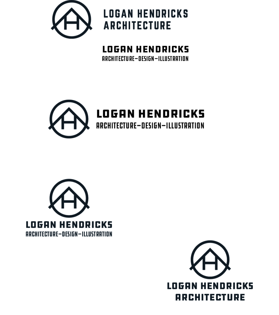
Below are the forms I have made up for the current iteration of the logo

So I did see this on your drawing set, and really liked it!
Kind of reminded me a little of the big sky logo, (which I like). I totally got the design intent before even reading this post. I though the logo was very simple, and concise. The L makes that nice right angle and I love the little ‘house’ it creates. I also like the ‘mountain’ aspect that I get from it, very Montana. I like the font choice, what is it?
Similar to Pat, I spent a minute looking at the logo before I read, and I agree, the intent is super clear. I thought “Oh cool, North arrow inspiration, Oh and a house! Oh, and it’s an LH!” I dig it.