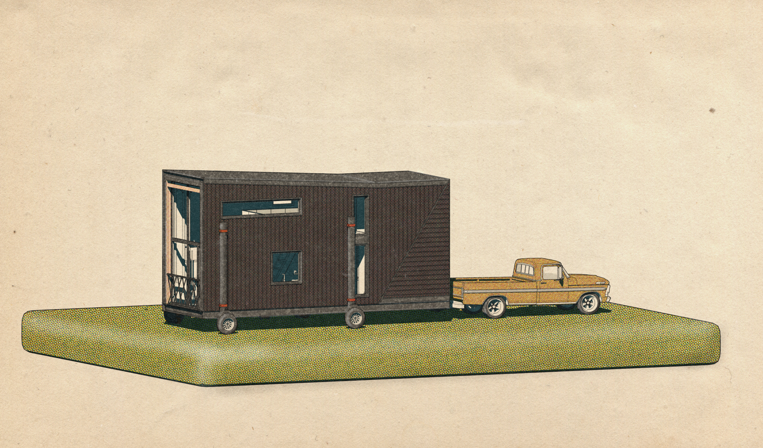
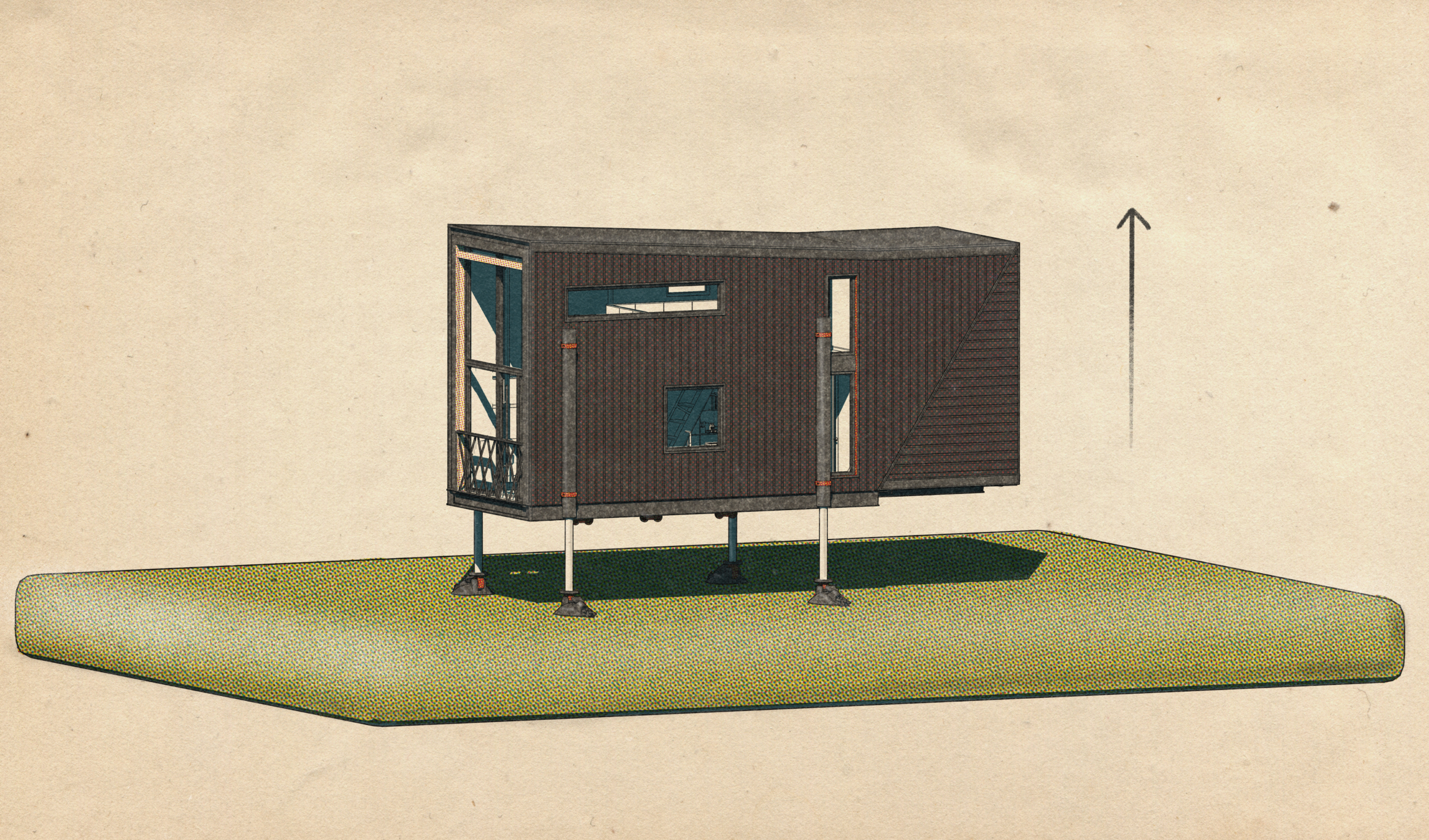
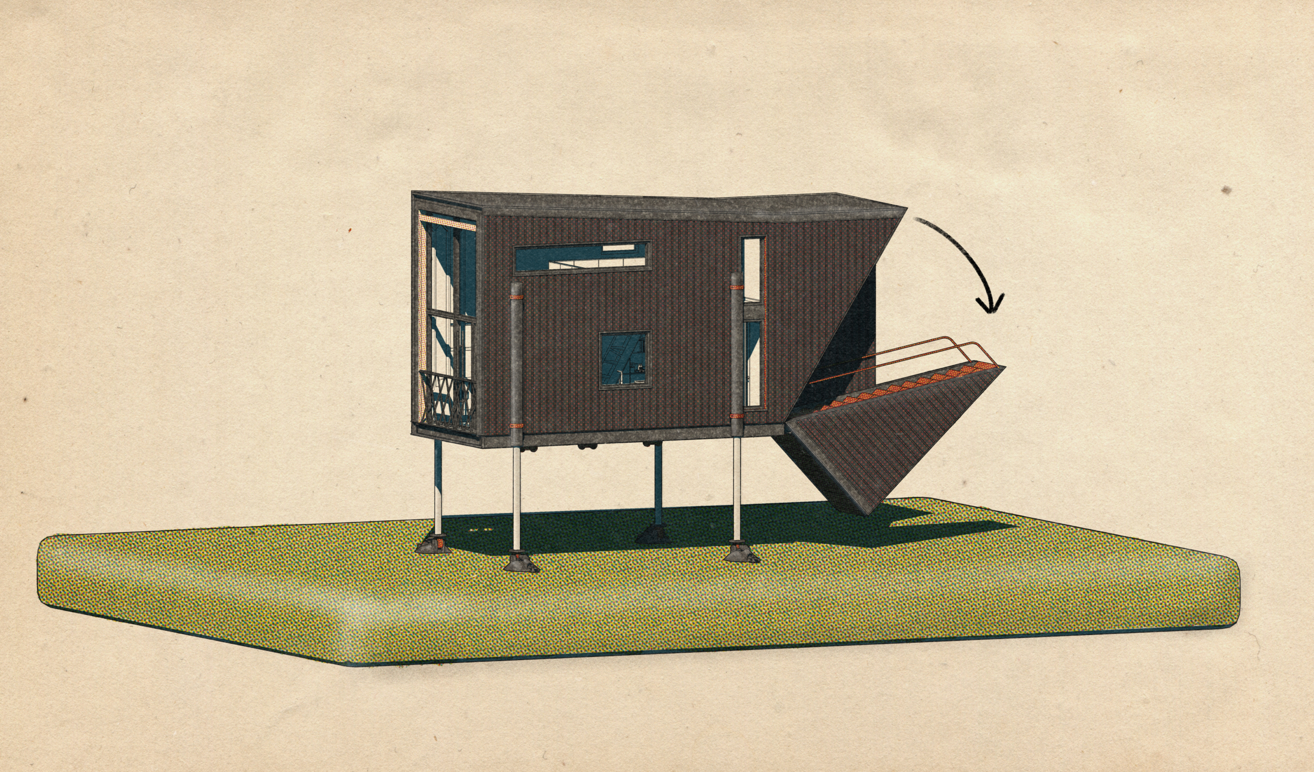
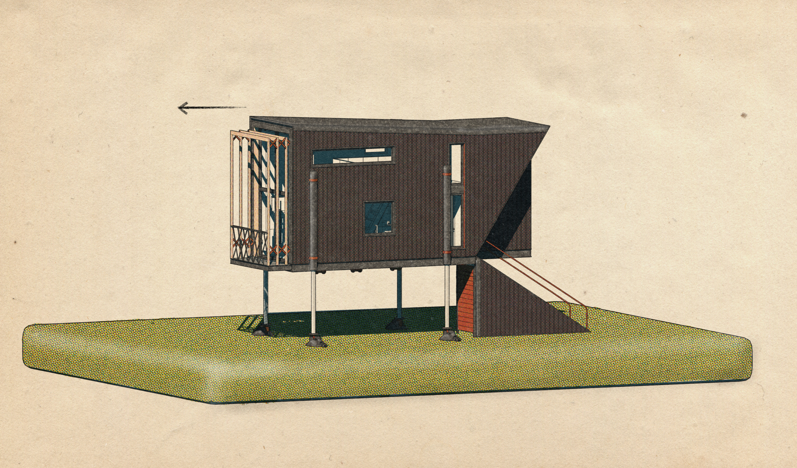
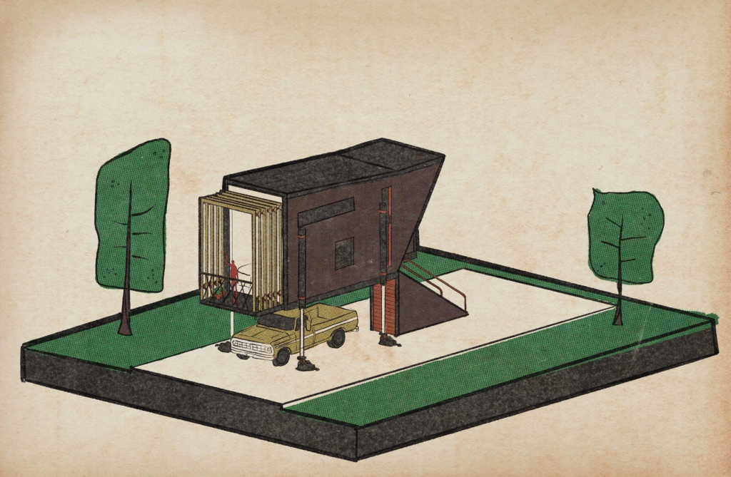
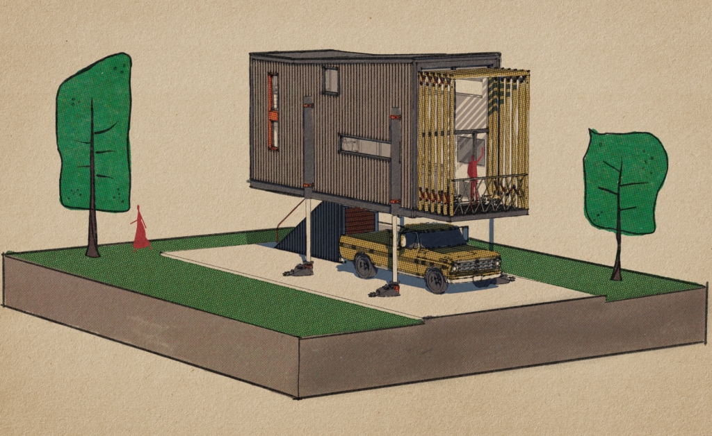
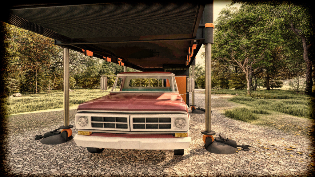
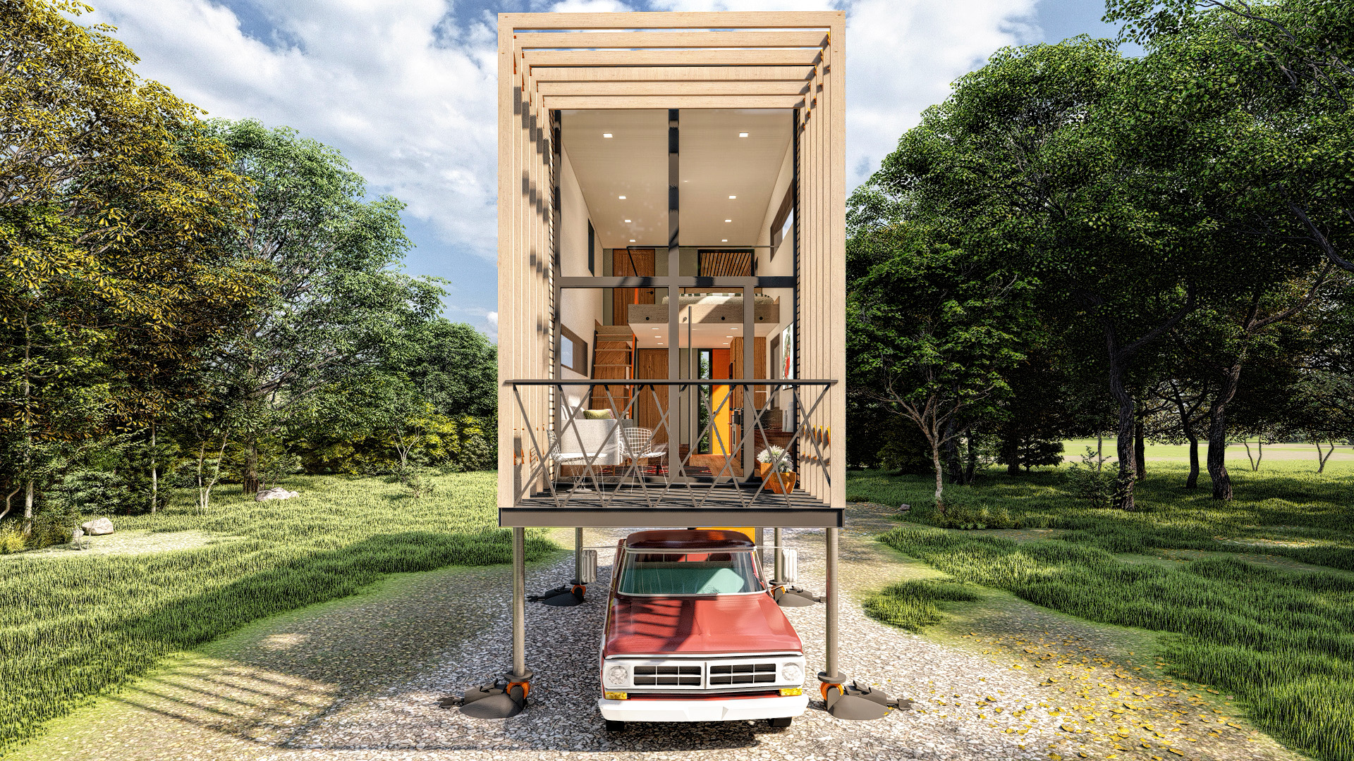
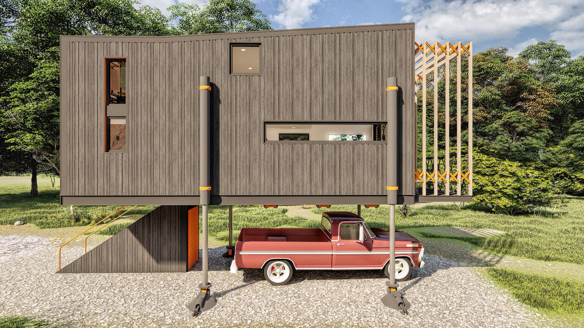
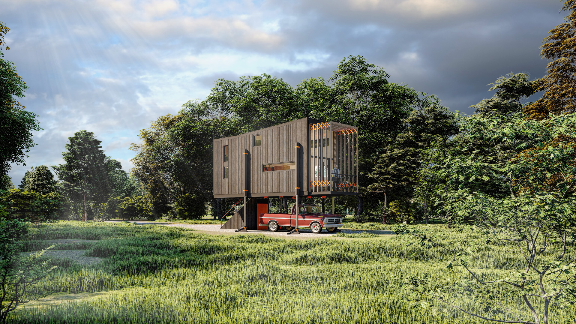
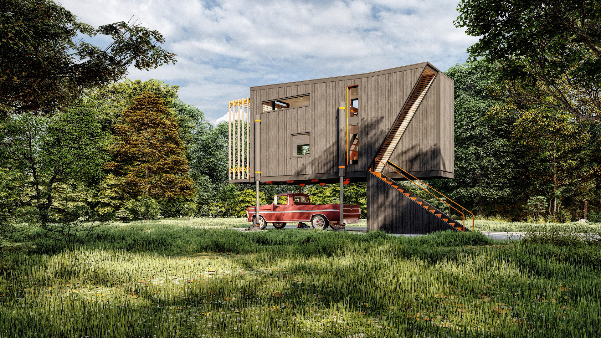
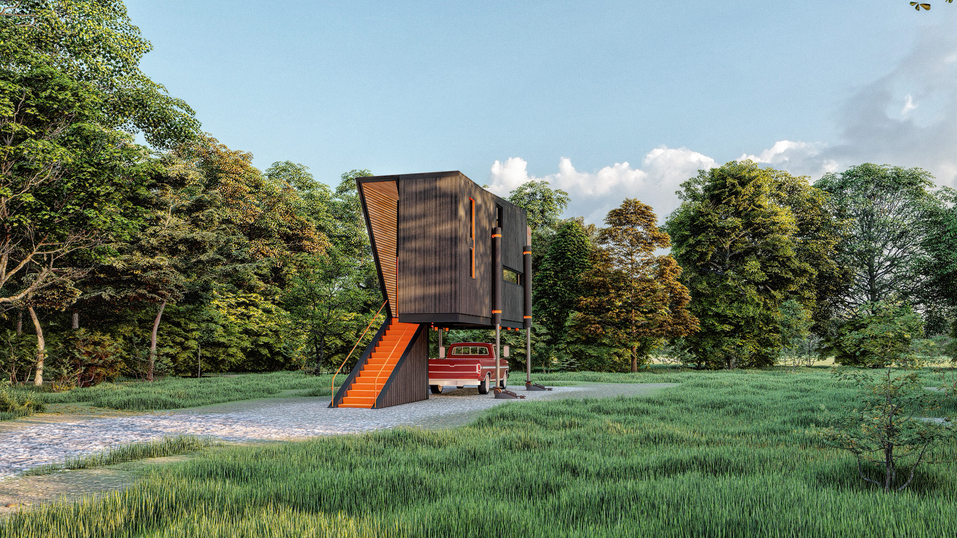
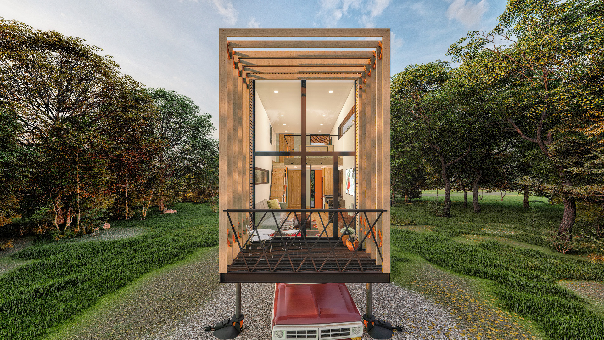
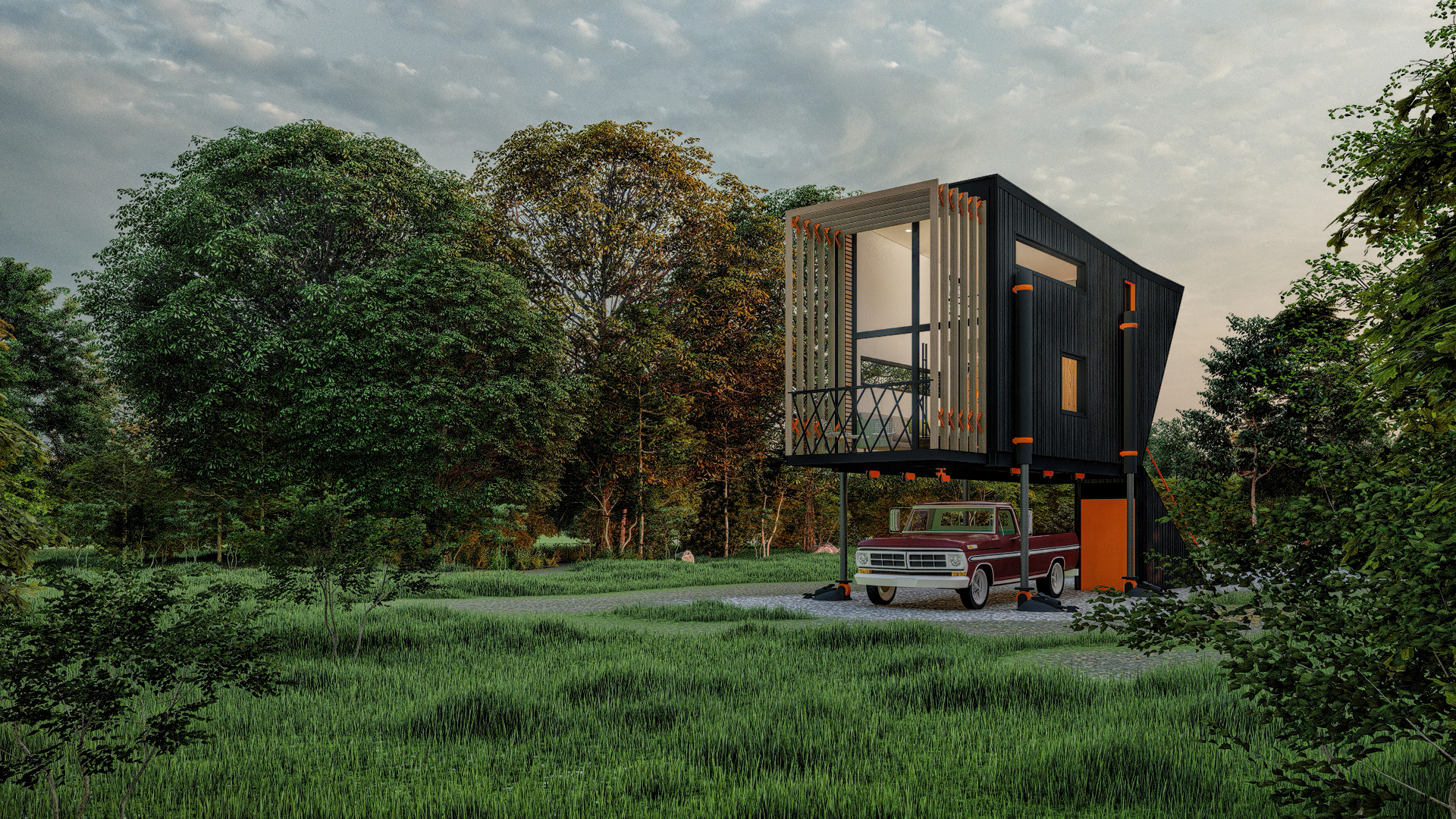
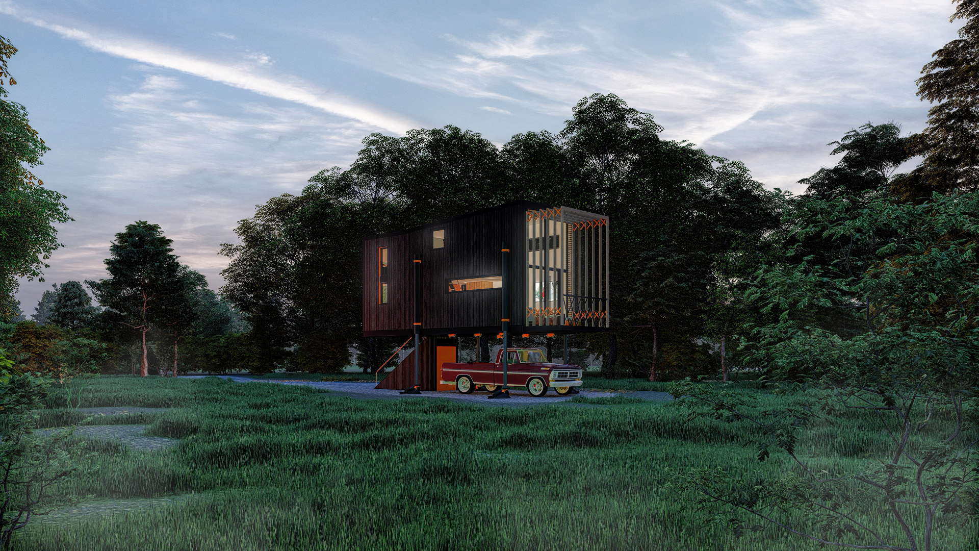
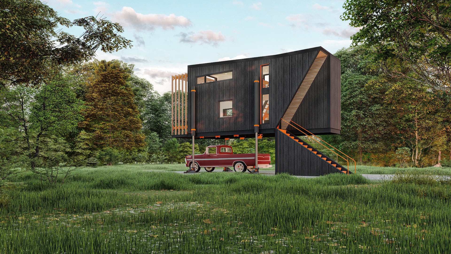
The Jawa Tiny Home, was designed around things you wouldn’t expect to see in a Tiny House ie. a carport, elevated living etc. The design is supposed to be fun and playful, but also hopes to solve many of the issues that make tiny house living undesirable for much of the population.
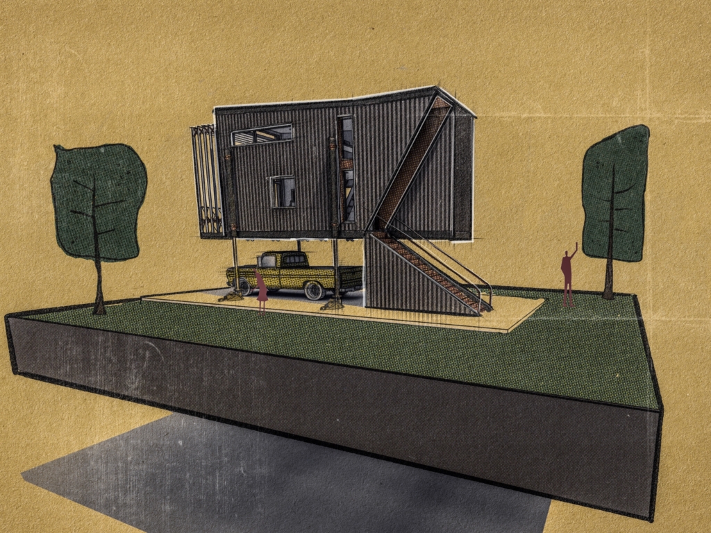
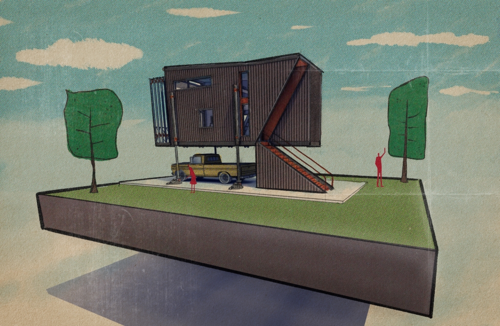
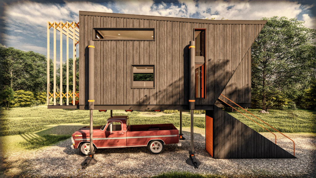
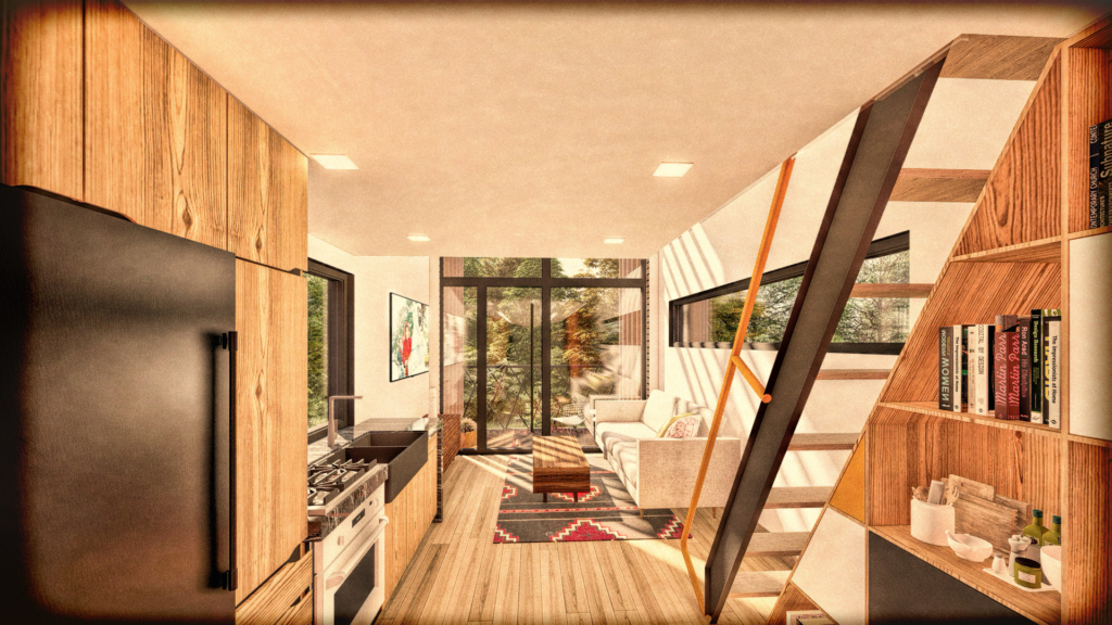
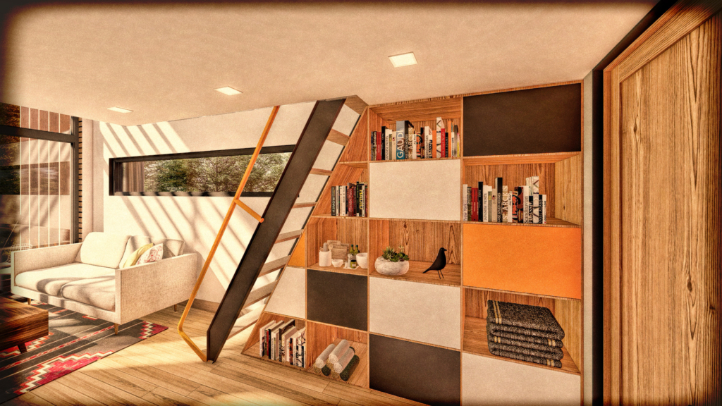
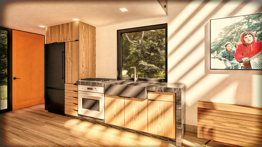
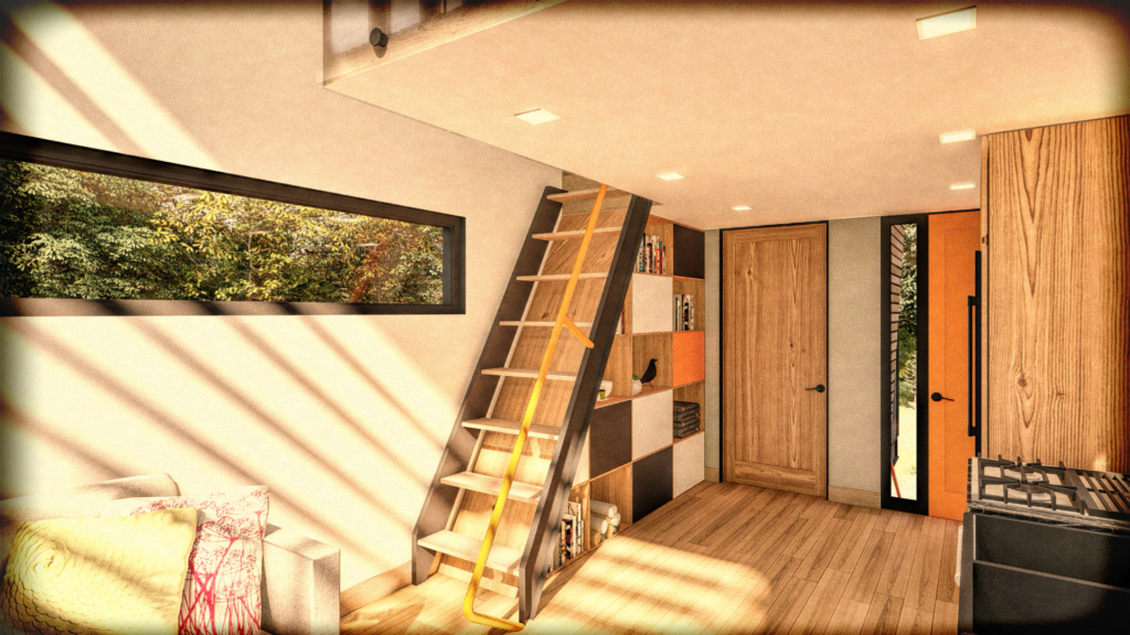
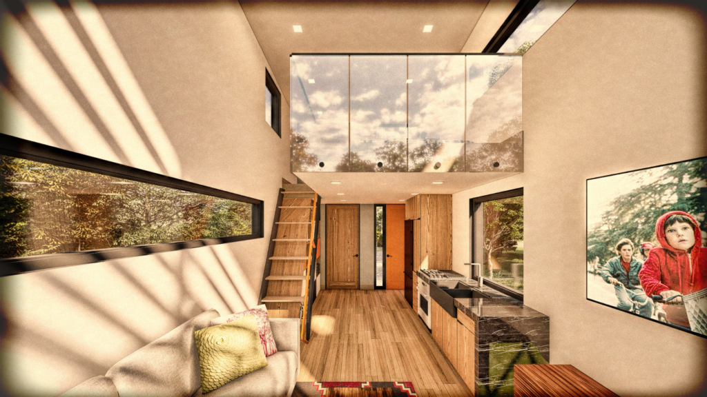
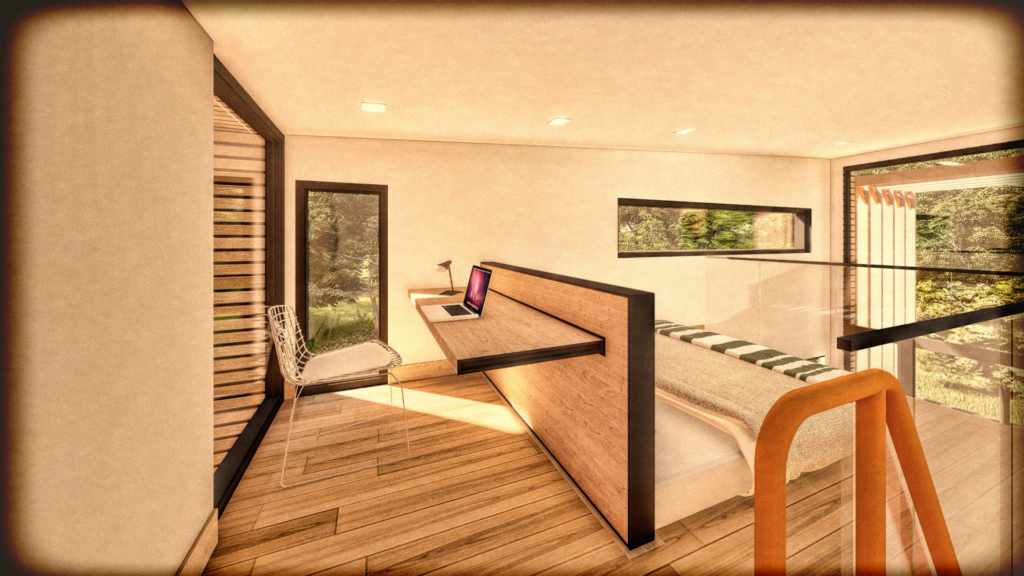
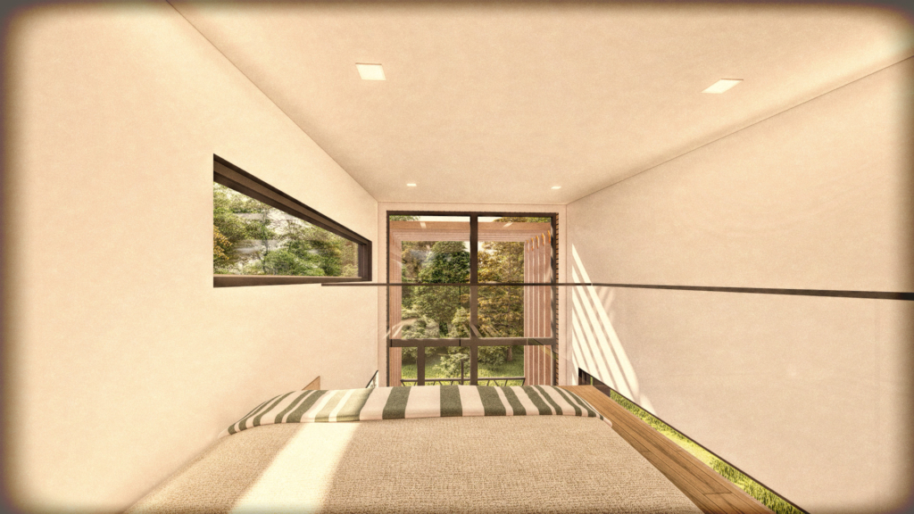
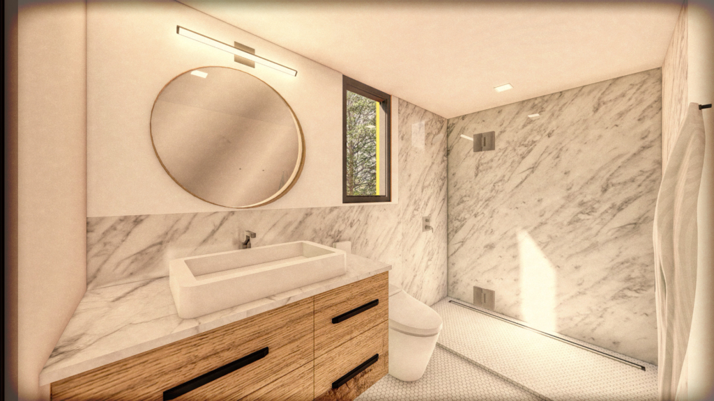
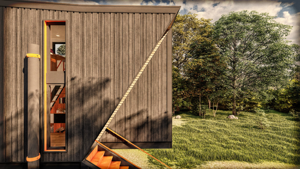
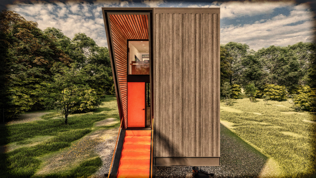
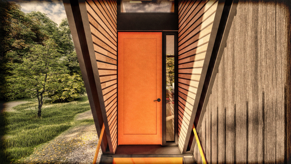
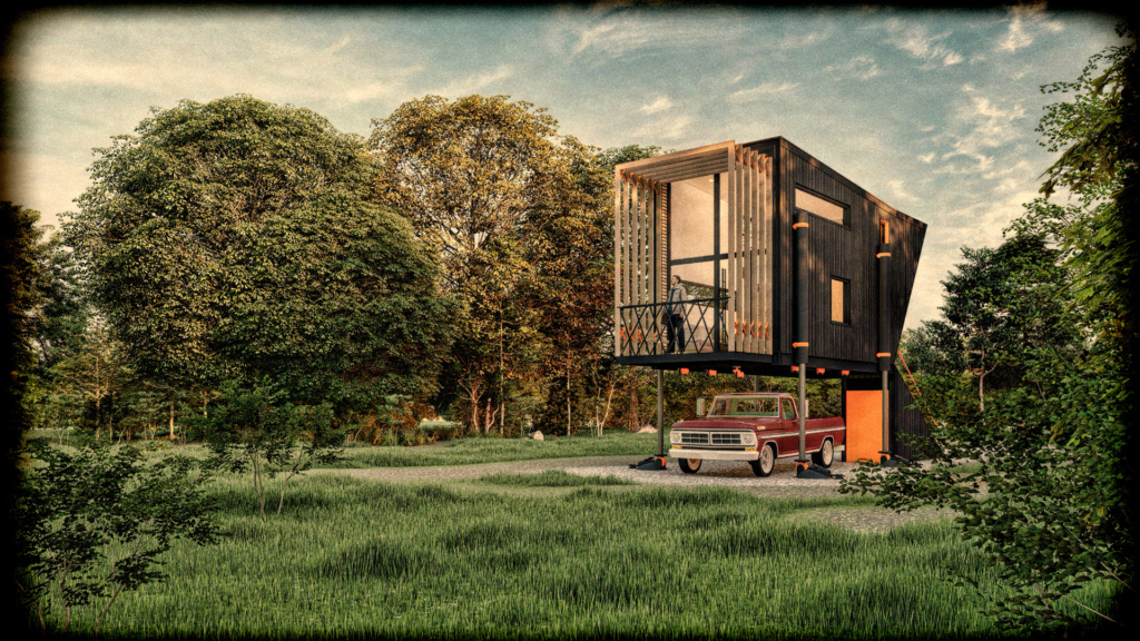
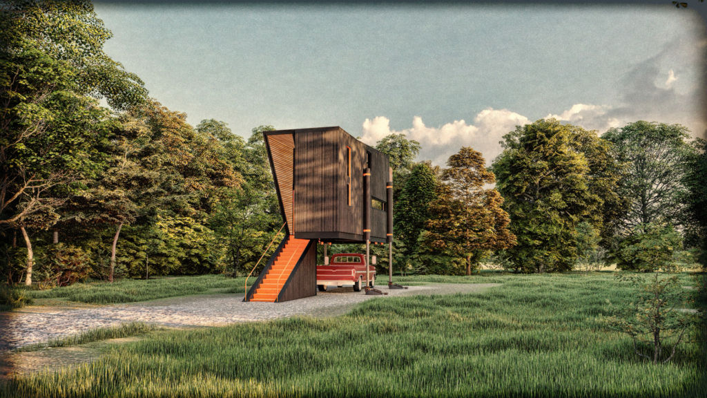
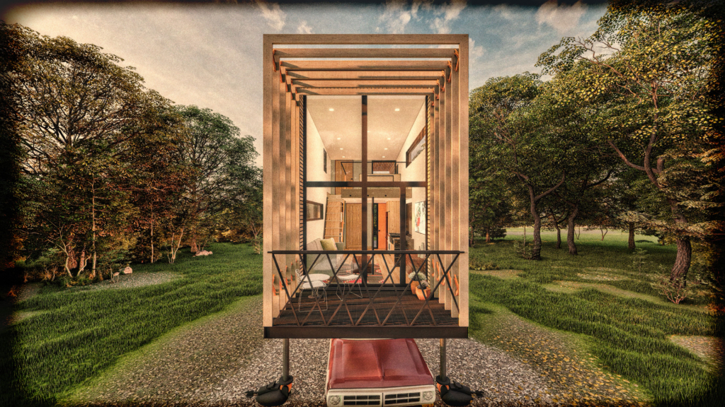
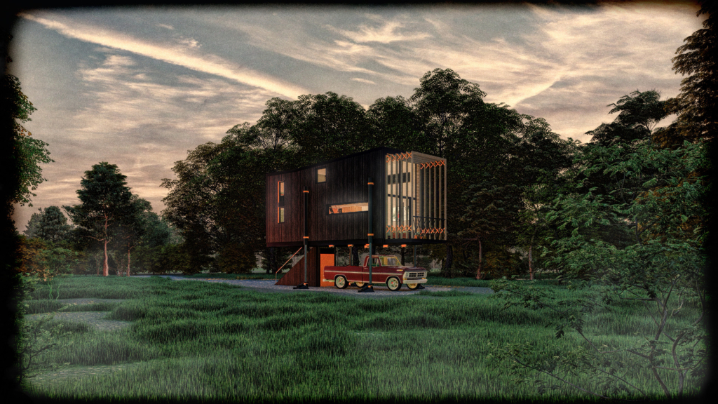
I had a lot of fun experimenting with new graphic workflows. The small scale of this project allowed me to experiment with video rendering techniques, more traditional graphic illustration, and photo realistic rendering. Photo realistic renderings are easier than ever for architects to produce, and the workflows are fast and efficient. The downside to this workflow however is much of the imagery you see today has a sameness to it. To stand out and keep things from getting stale it is always fun to use a project like this for experimentation. I tried to achieve a retro 50’s/60’s magazine advertisement feel with all the graphics and layout.
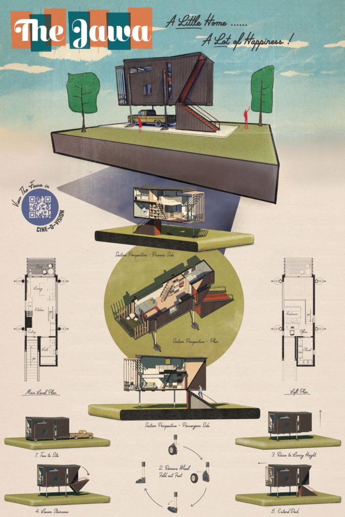
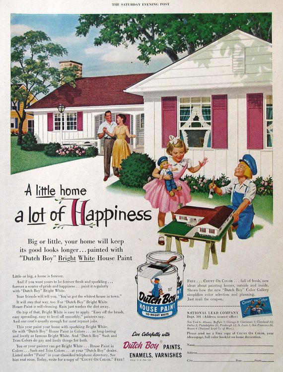
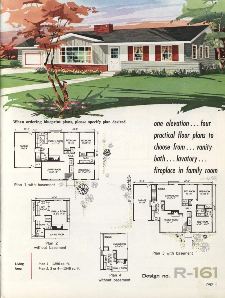
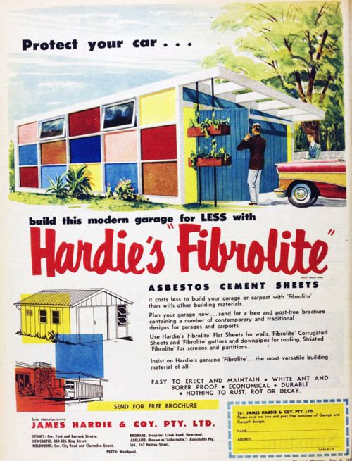
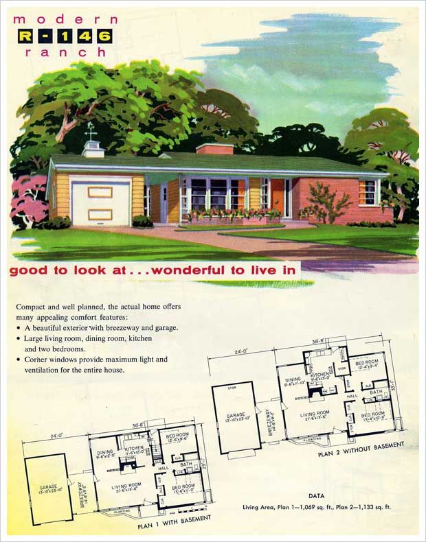
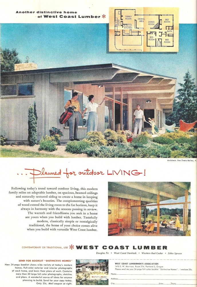
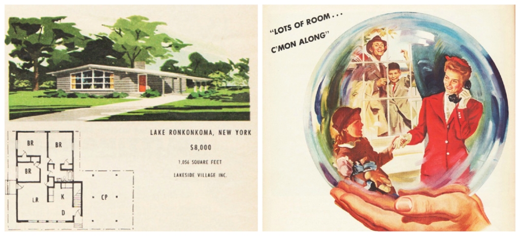
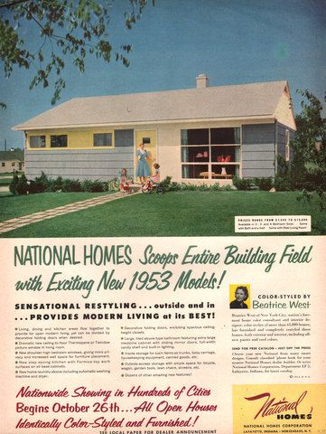
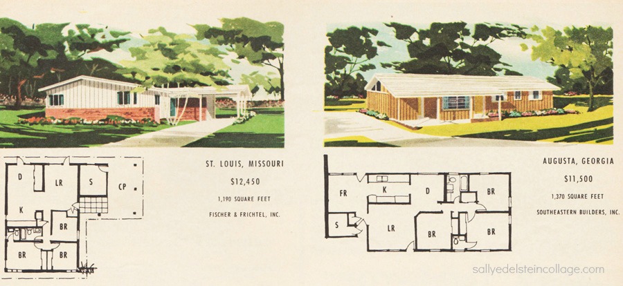
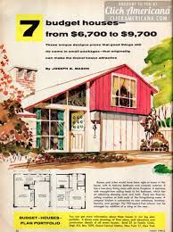
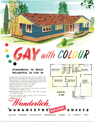
I used the images below for board/graphic inspiration. I think alot of these old style images and layouts are really emotive. They are often focused on how people could use the house and not so much on every single little detail. I really wanted to combine these with some cleaner modern techniques.
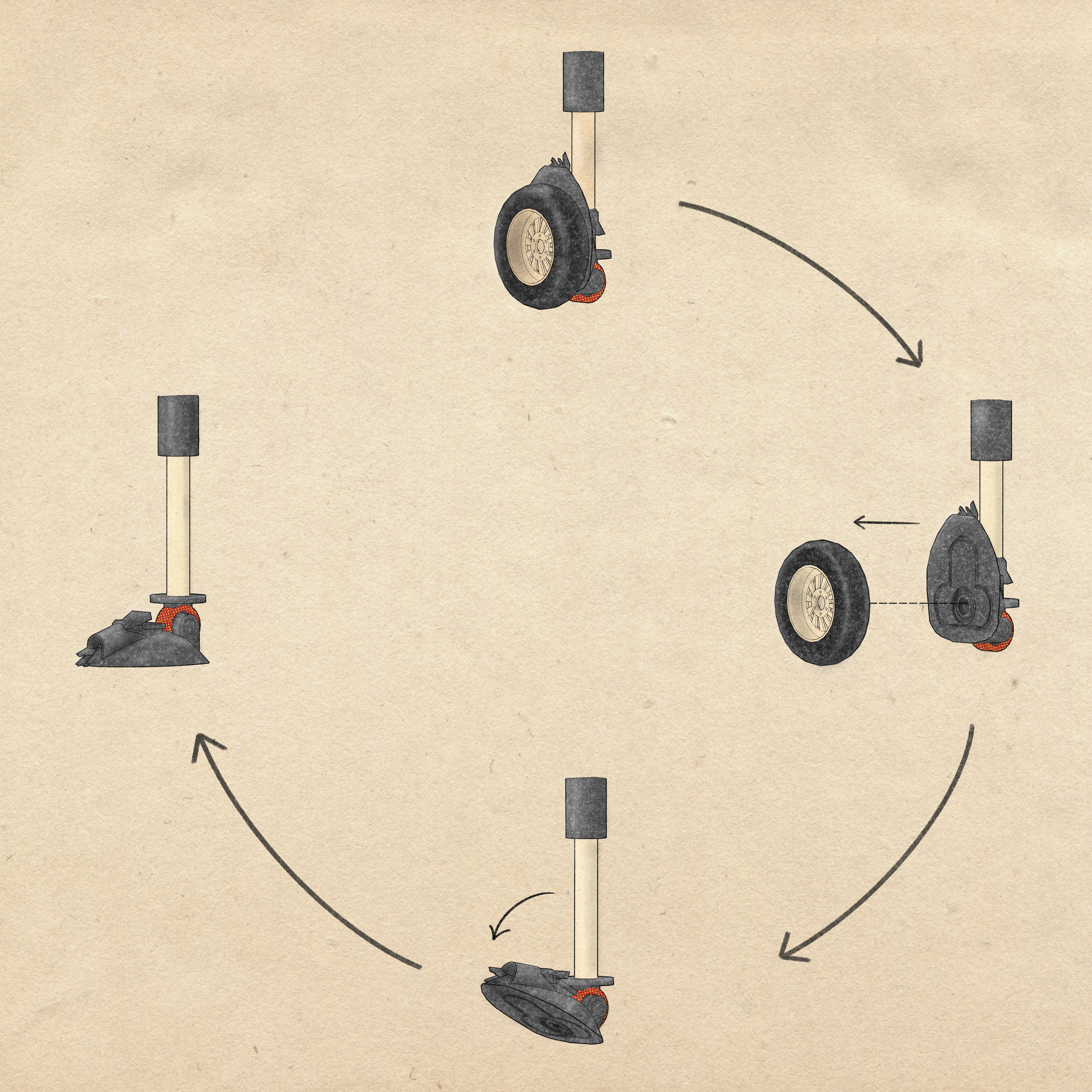
Since the whole things is mobile and has moving parts I really wanted to make an animation to show off all of those parts. I wanted all the materials to have that retro feel so I started trying to add film effects to make it look more like super 8 film. I ended toning down these effects to make it a little more subtle (mix of modern and retro). I also added sound Fx for all the parts that move. I think the sound really makes the video more immersive.
I try to focus on real world type video shots when I make these digital videos. I see a lot of architectural video that just has the camera cruising through the whole building and I really dislike that style of setting it all up. one new type of shot I used quite a bit was FPV Drone shots. you can achieve crazy shots this way, but I tried to make my digital ones look as close to real world ones as I could. I really enjoy this guys drone work. see link https://www.youtube.com/watch?v=WQ7NbJbpZOg
I learned a fair bit about video editing, overall pretty easy and not too dissimilar from editing still photos. I did all the editing on my ipad using Luma Fusion.
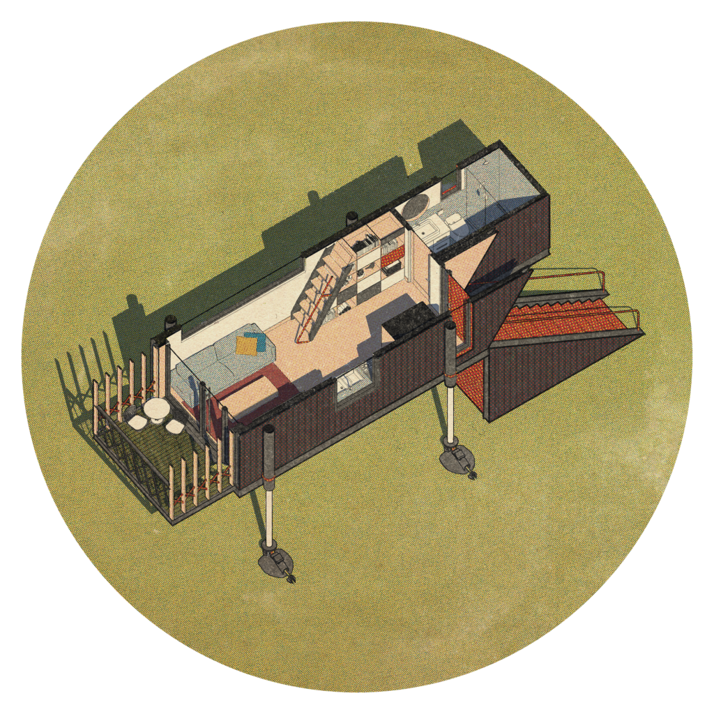
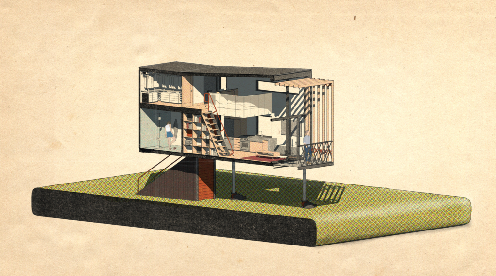
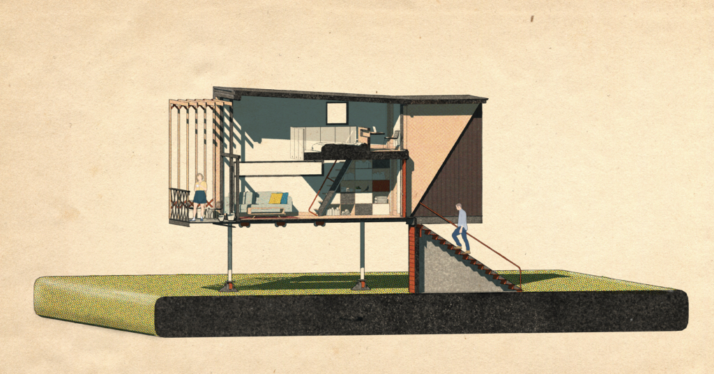
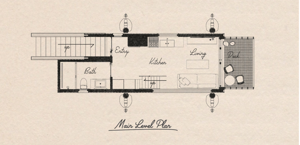
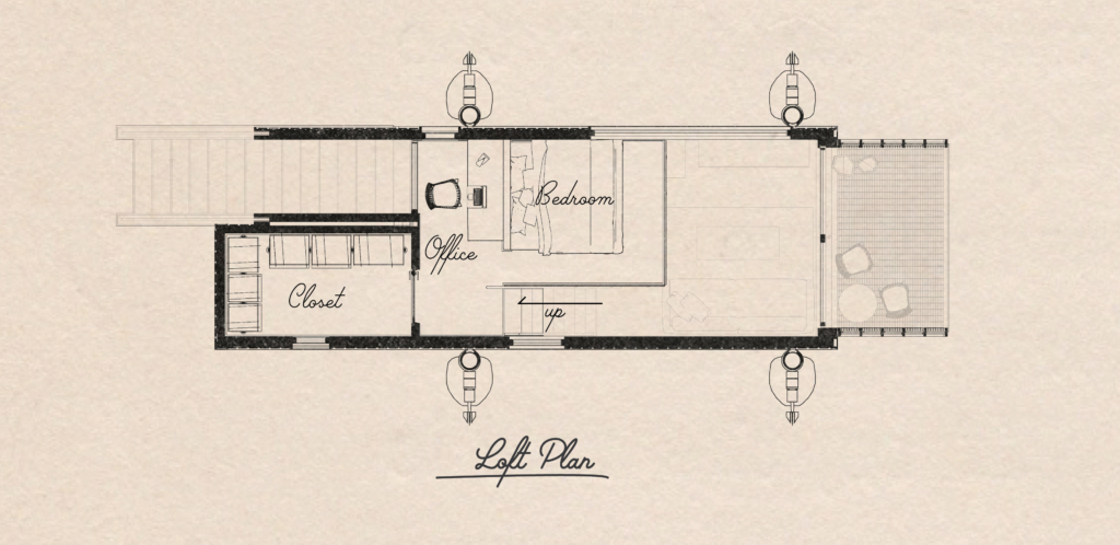
This shows some of the Graphic experimentation I did before landing on a workflow that I liked.
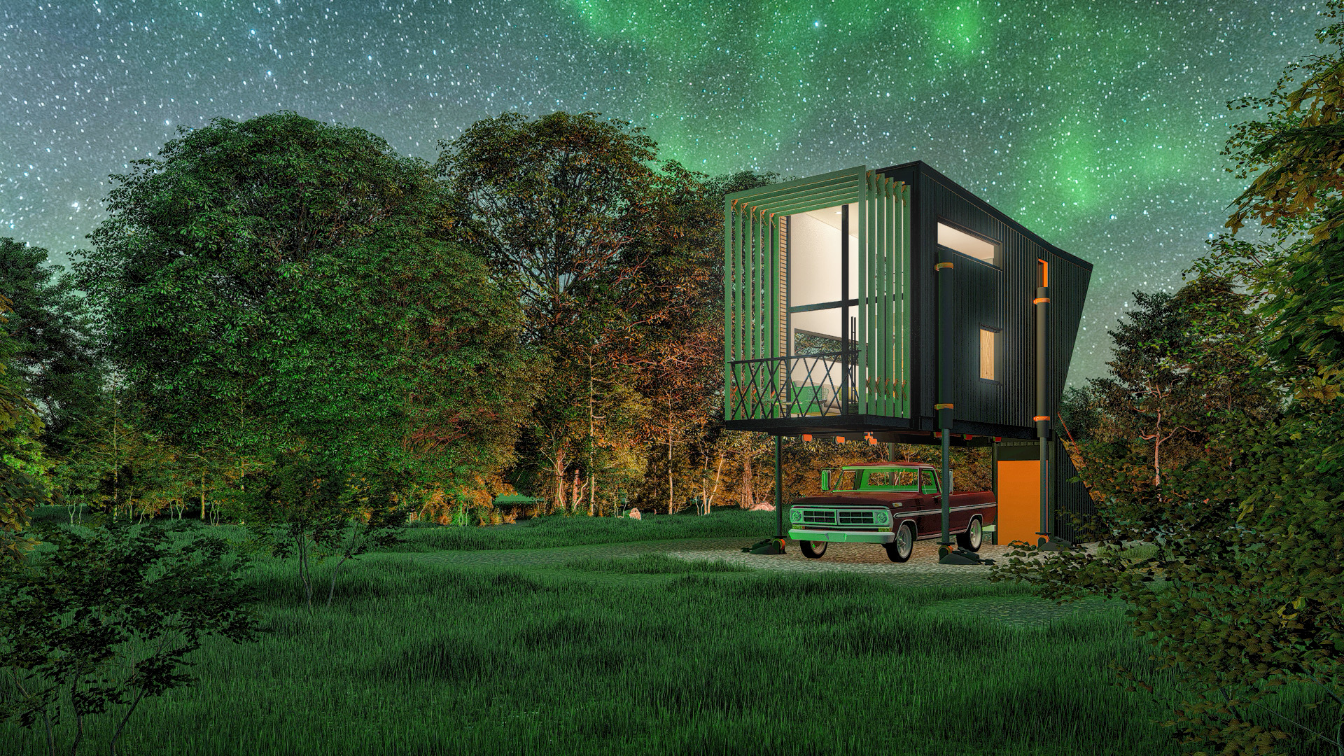
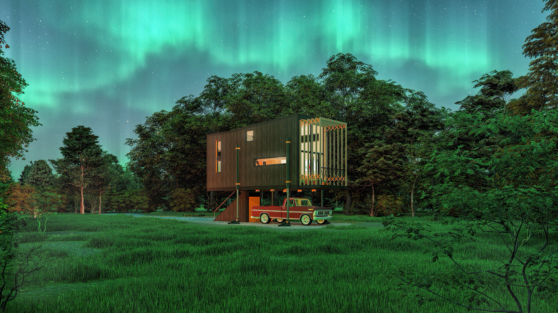
I figured some retro snapshot style renders would be a fun bonus to link the the QR Code. The QR CODE on the board take you to a webpage that contains the video and these snapshots. https://www.loganhendricks.com/jawa
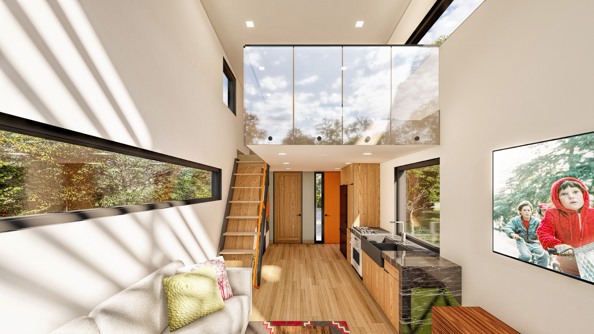
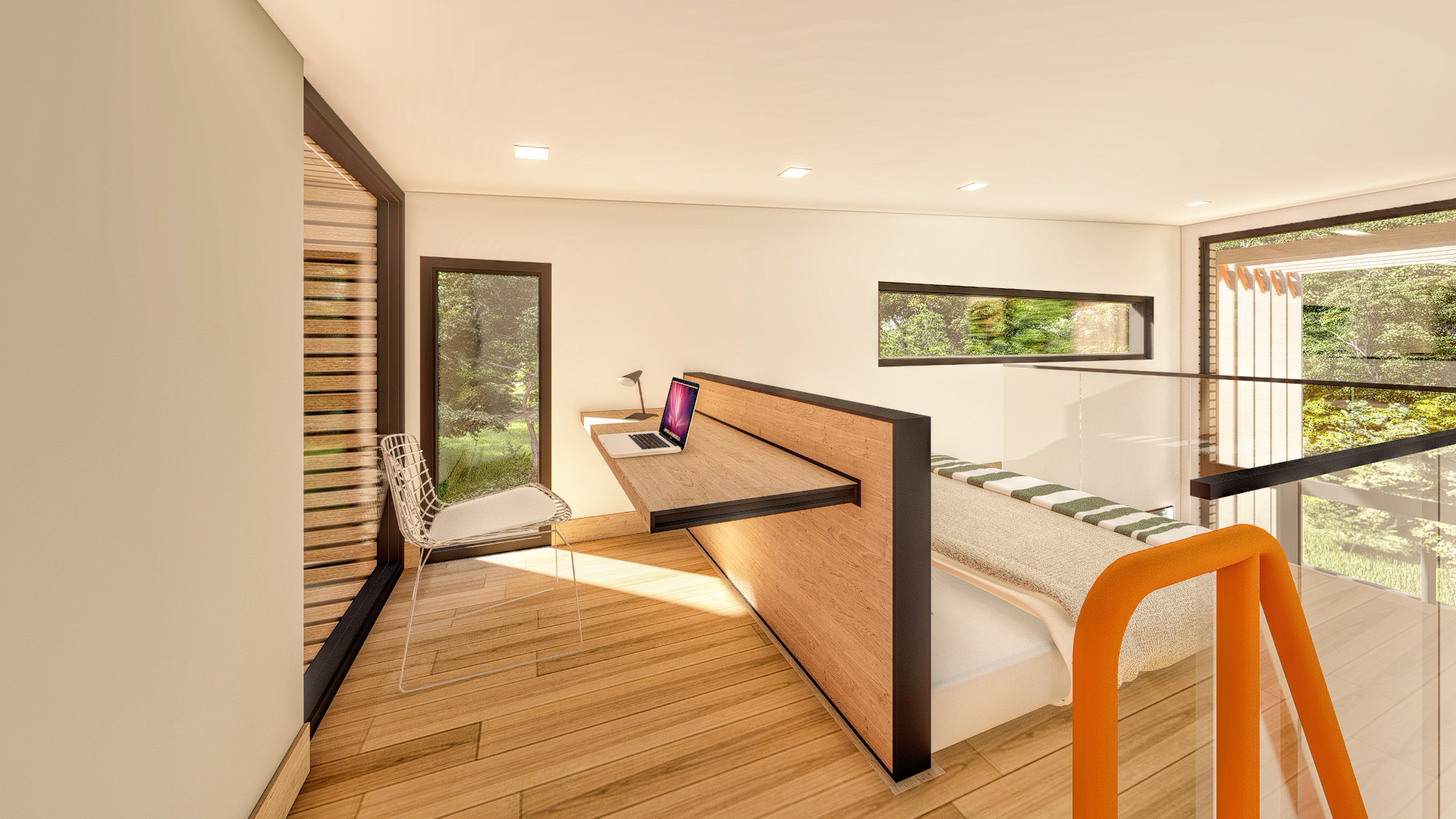
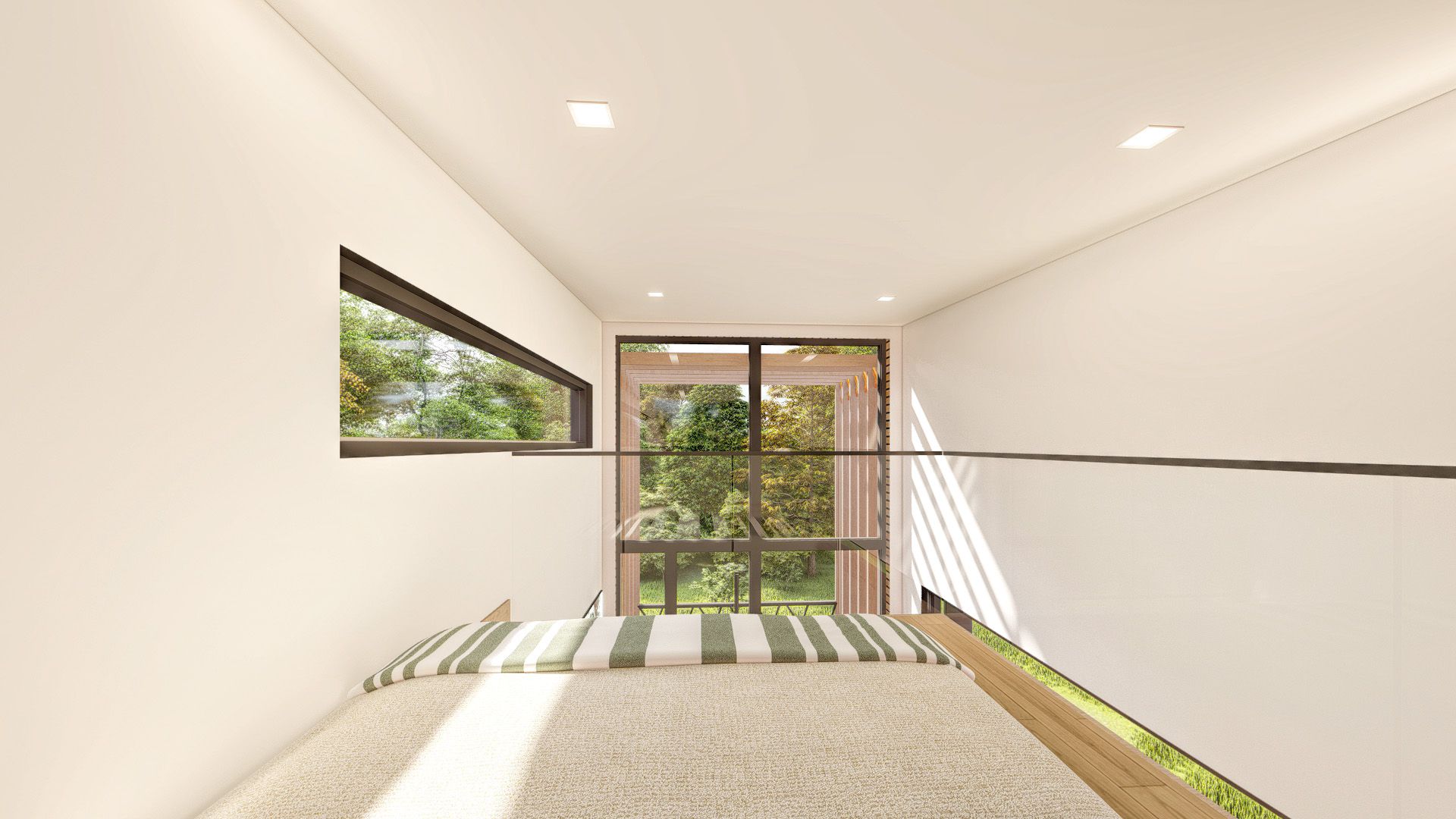
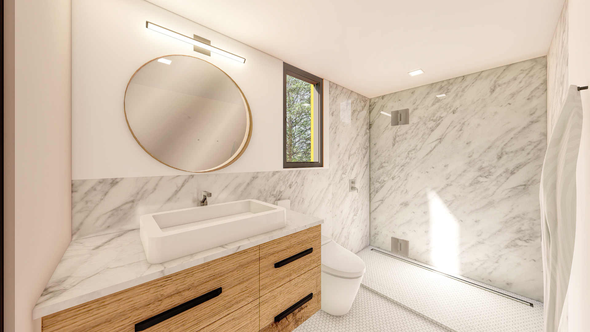
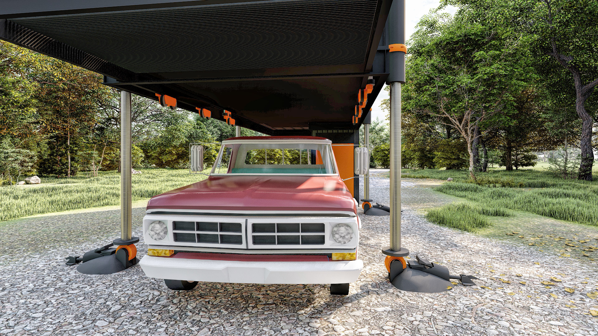
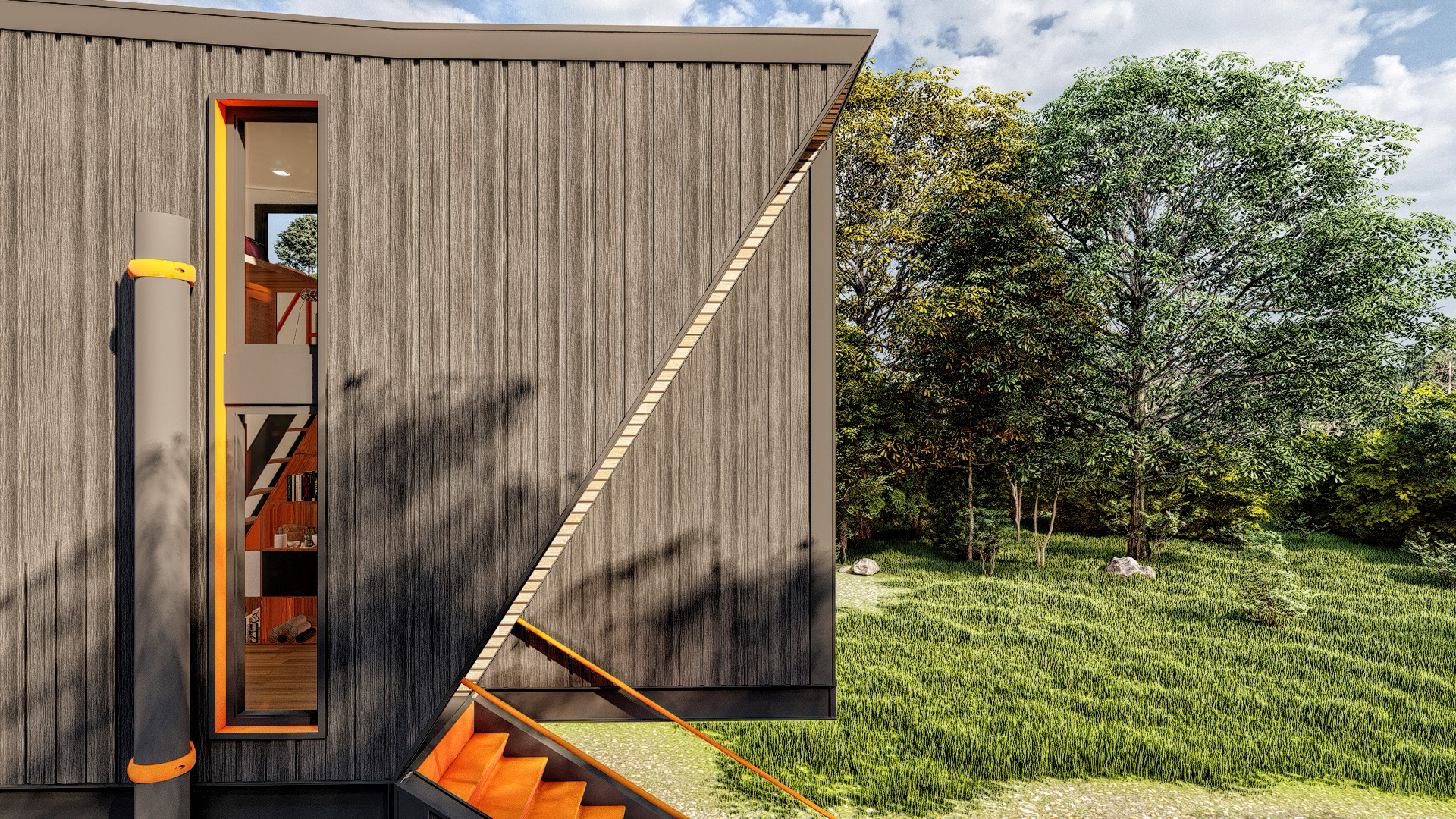
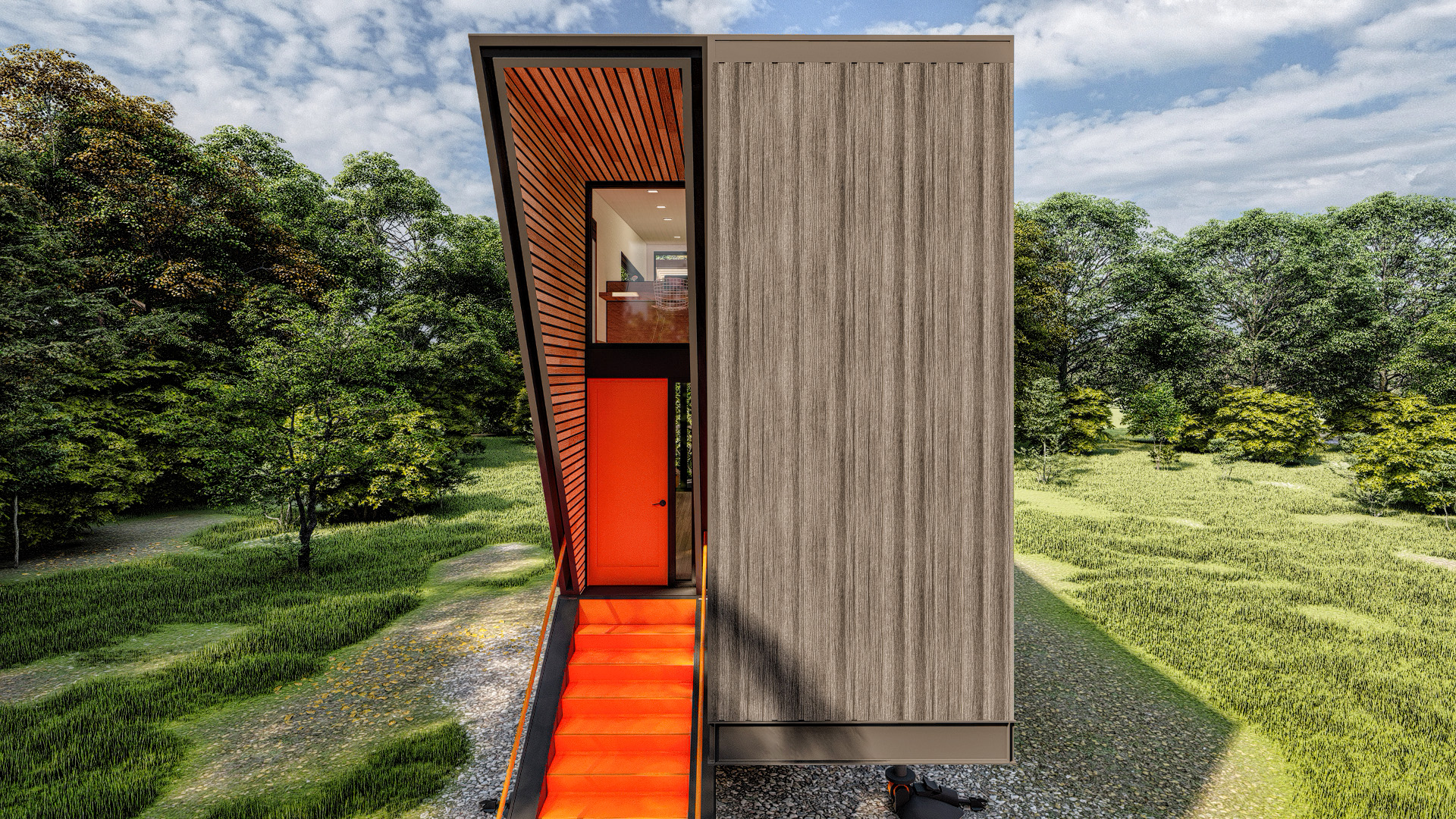
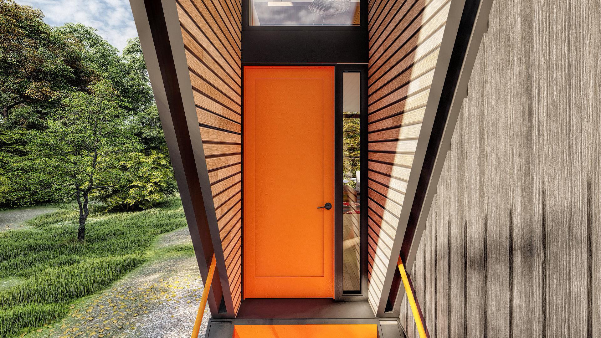
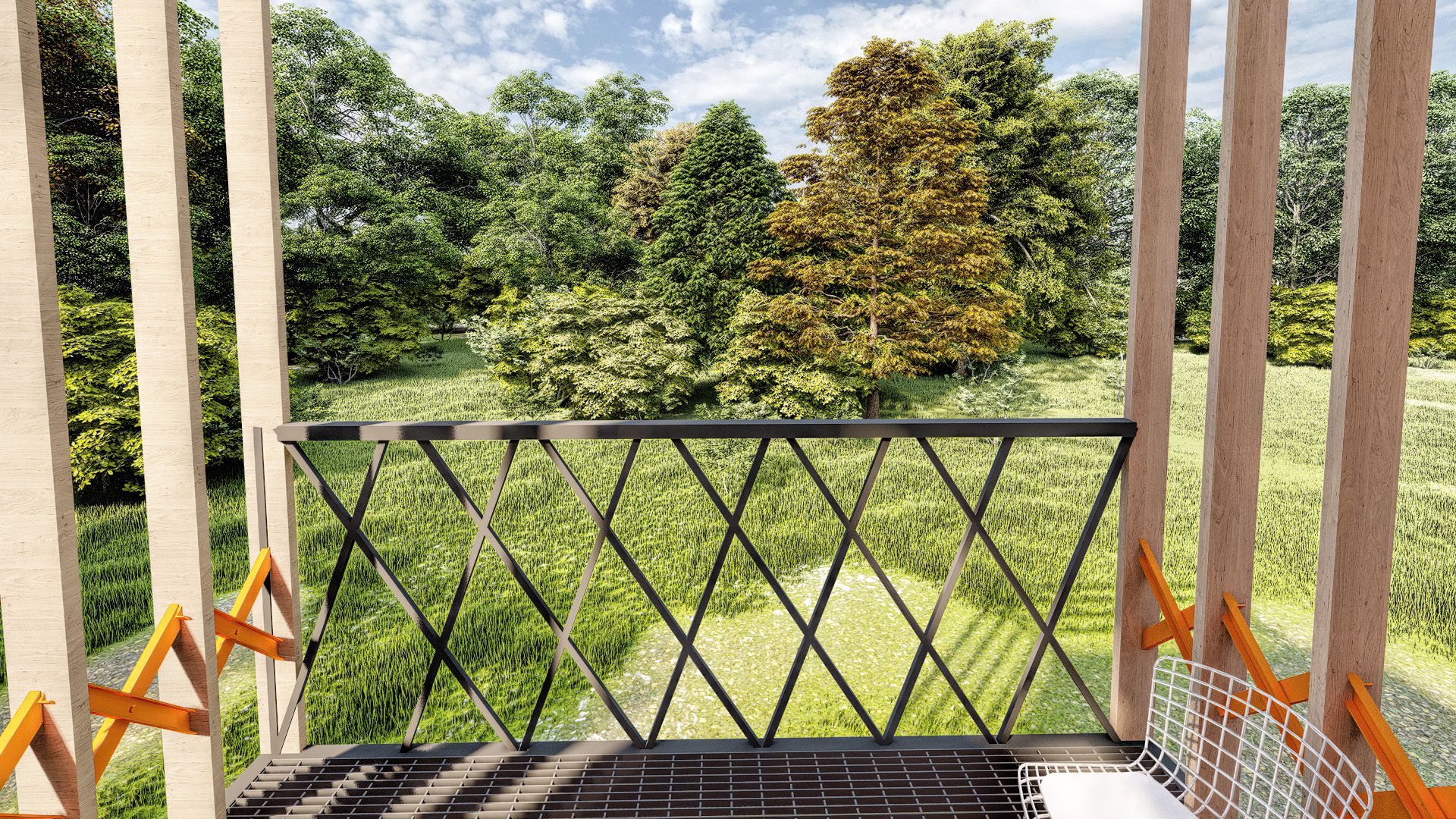
Here are the non retro shots just for reference.
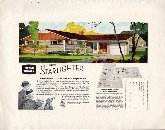
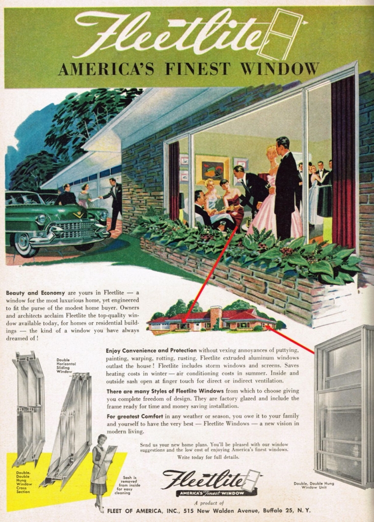
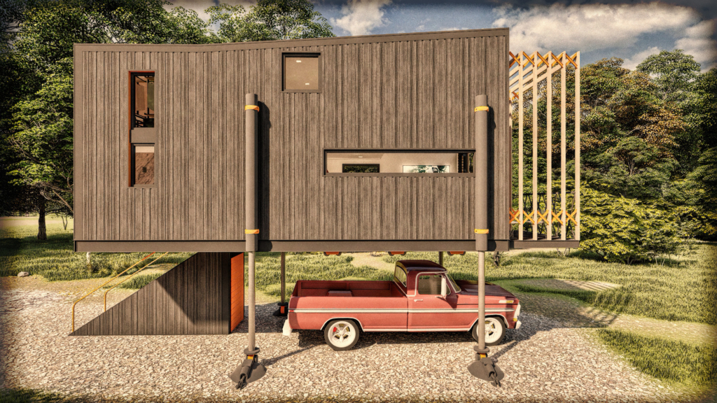
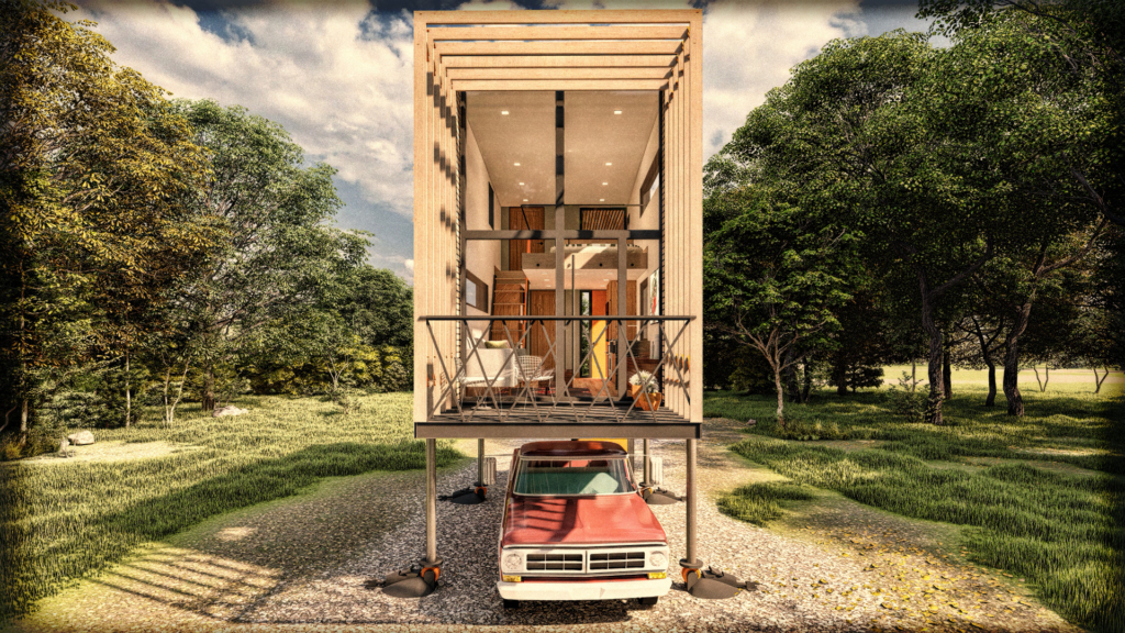
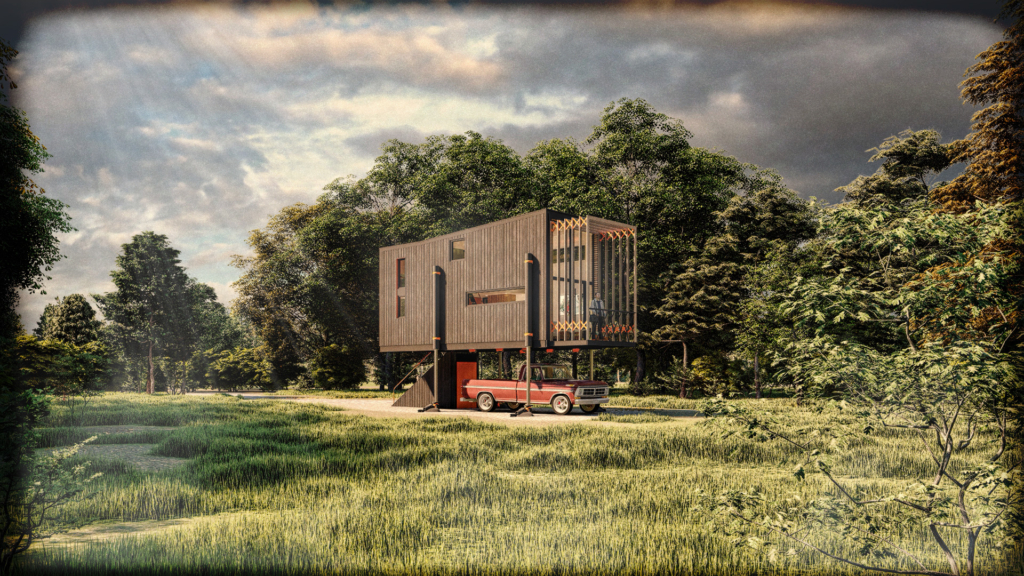
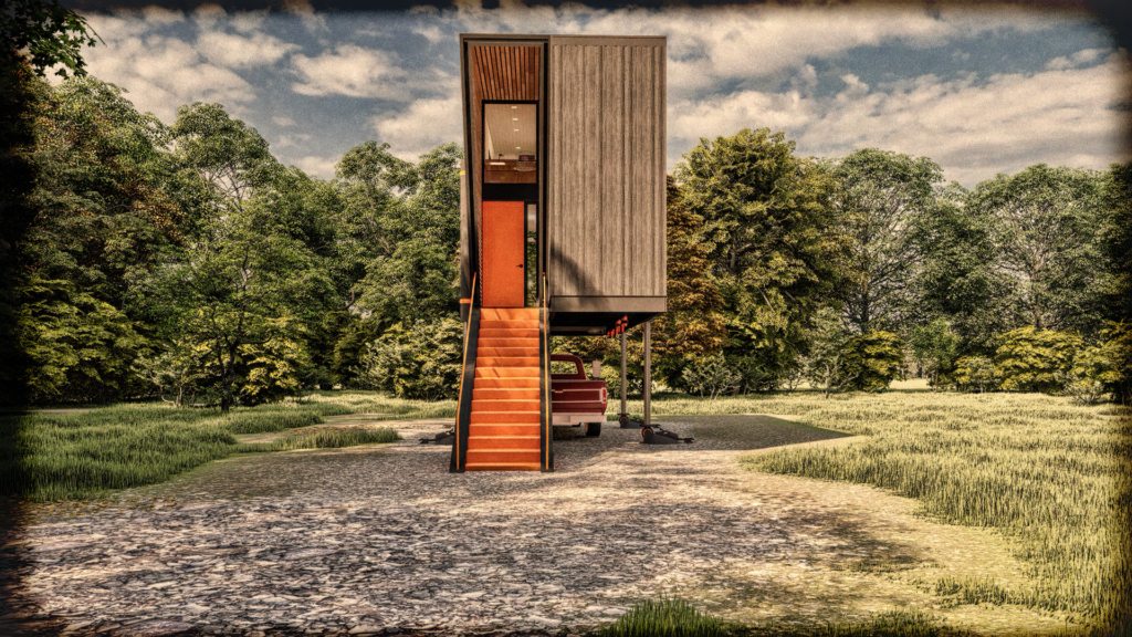
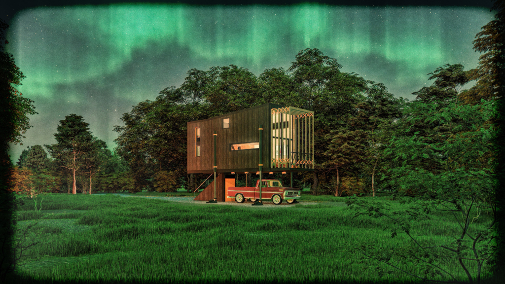
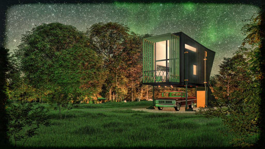
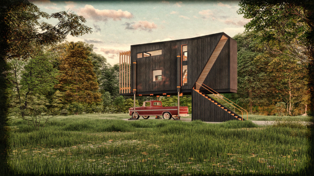
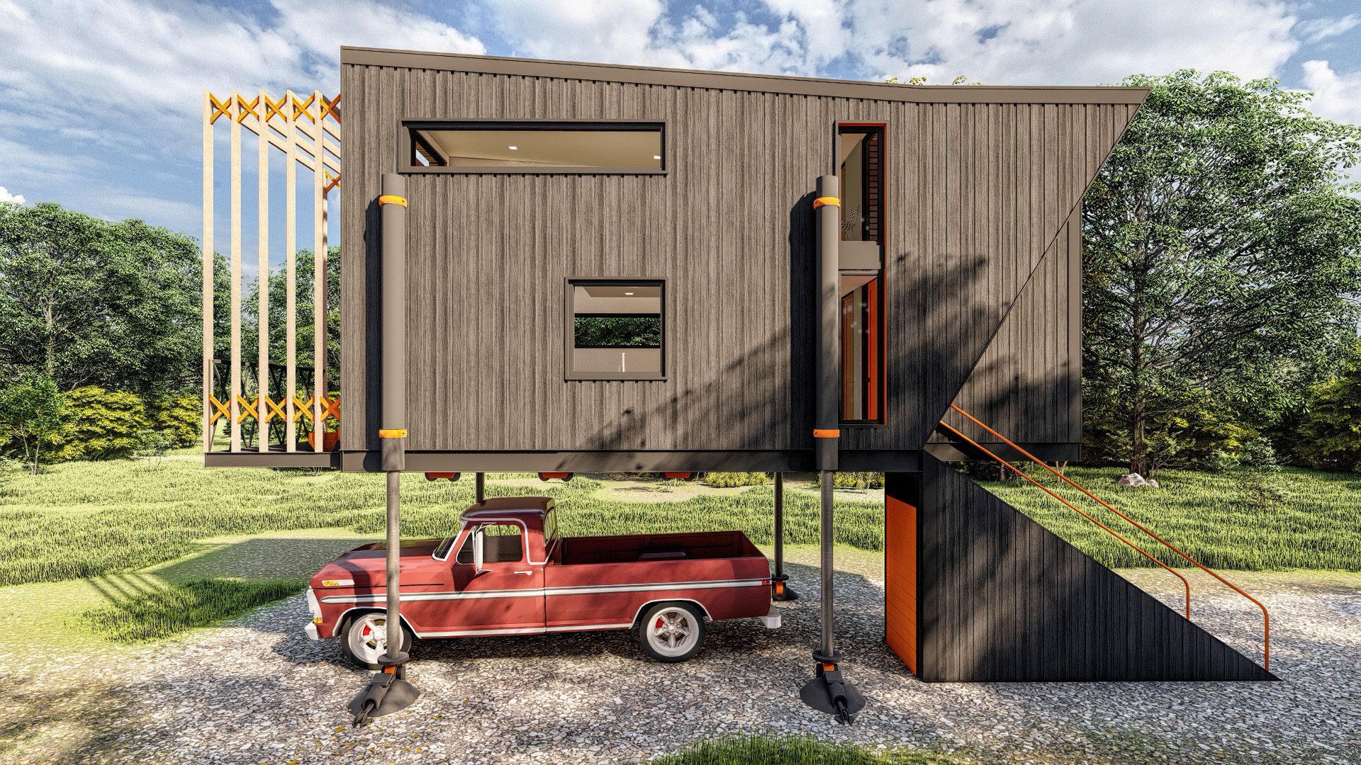
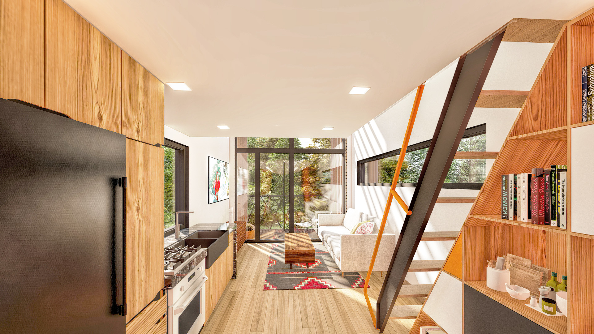
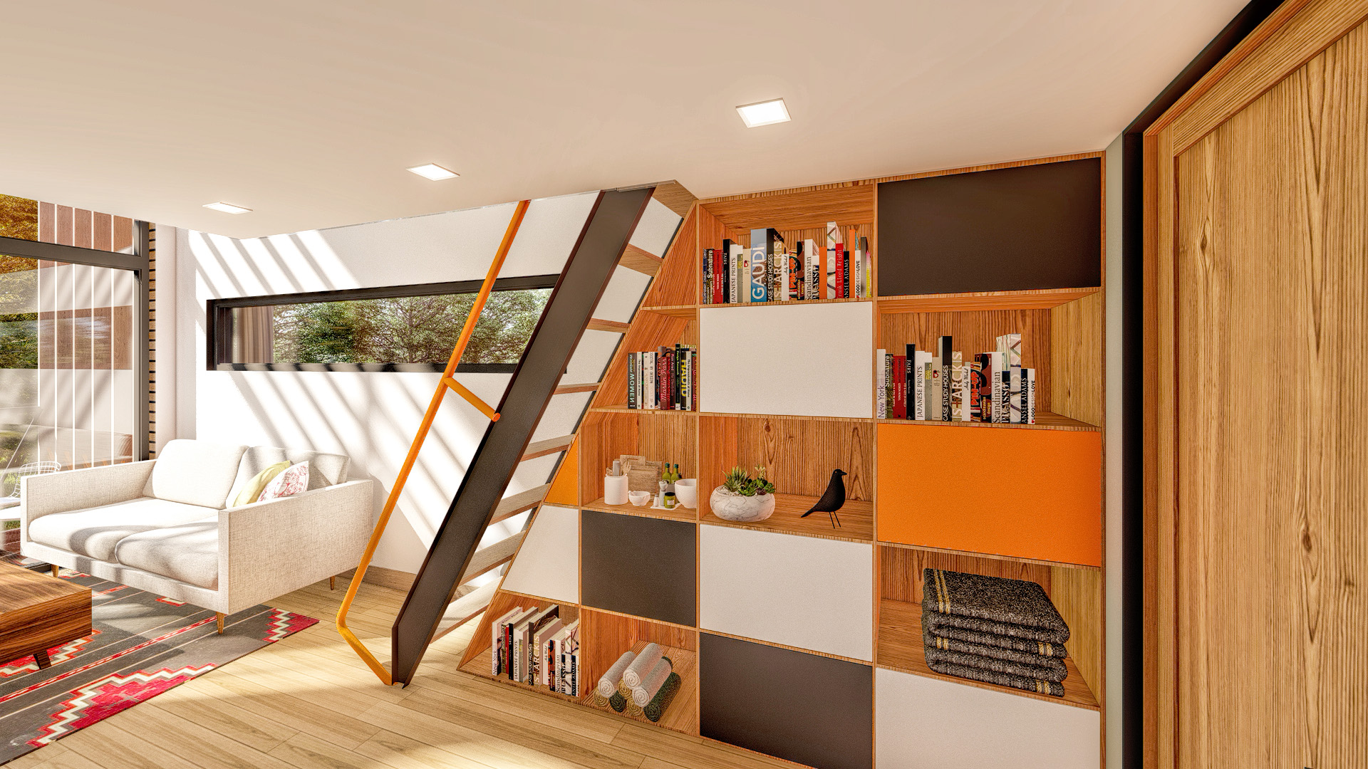
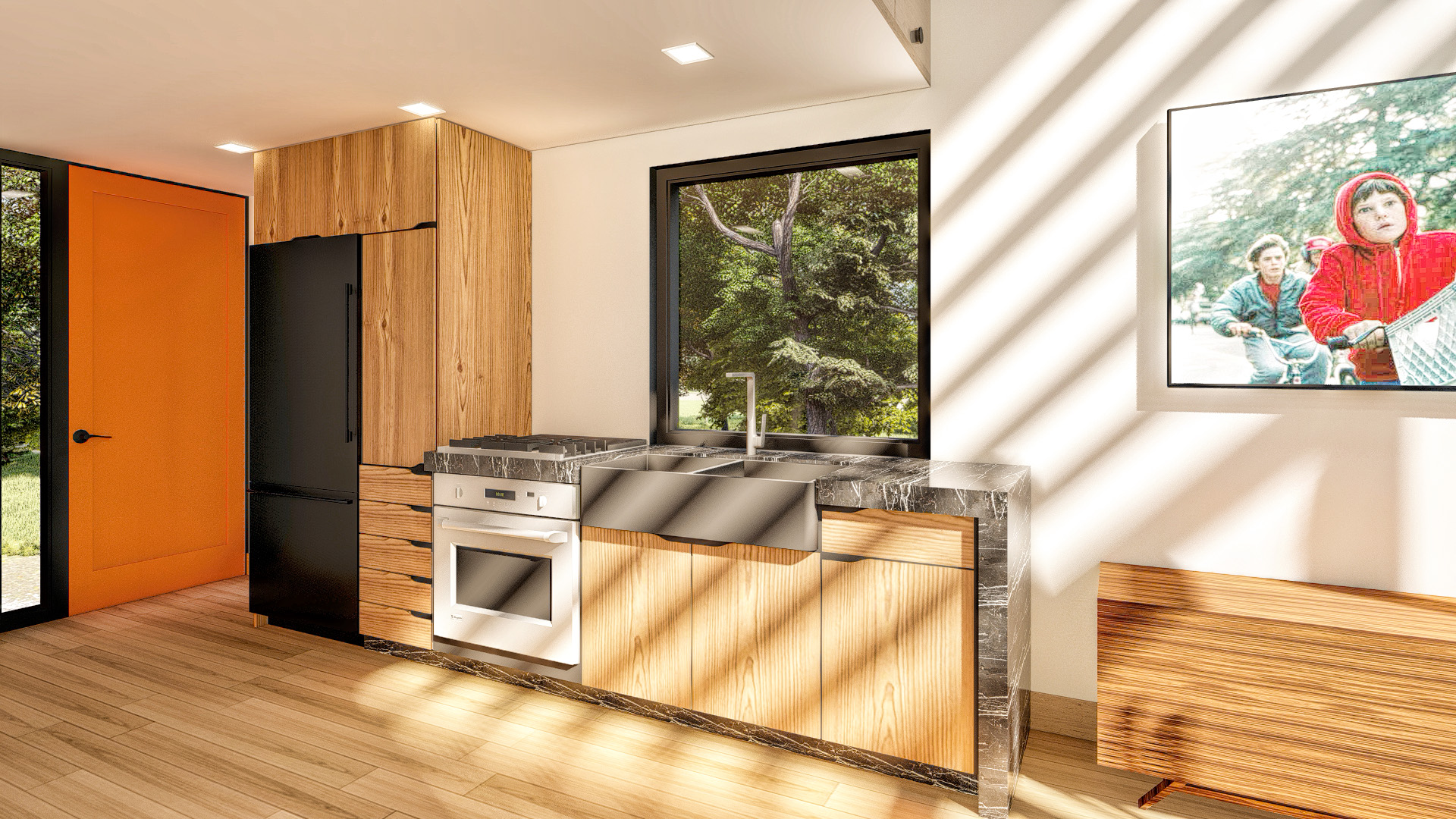
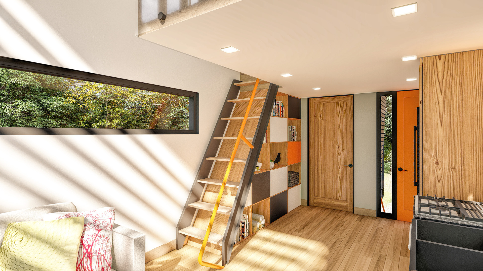
This is awesome. love the video style, and the graphics style. really captures the “airstream trailer in a galaxy far far away” feel.
Thanks Zach, I really appreciate the kind words. I always forget to check the comments, but it is nice to look and see that someone other than Pat has commented haha .
Really great work on all of this! I’m actually pretty shocked at your effort in this project that was pretty much just for yourself. Where along in your design process did you decide to go for the retro style? I think the end product came out amazing in the design of the home, and the presentation. everything is well thought out and your graphics help support your overall feel of the design. I love all the little details too, you even have the graphic of the wheels coming off! The inclusion of the vintage adds really helps pull this post together nicely. Hopefully you can find a competition to actually submit the design!
Thanks man a really appreciate it. It felt good to really take some extra time with the graphics.