Architecture, Billings Montana, MT
I have been following this guy on Instagram for a few weeks http://www.beeple-crap.com/everydays.php . He makes a new digital image every day, and has done a new image for 3493 consecutive days.
I got inspired and decided I wanted to try my hand at making a quick image. This is what I came up with. The whole process (not including render time) took me about 2.5 hours. It was super fun to be able to make something from start to finish in one evening and be done with it. usually in architecture we take days and months and sometimes years iterating, which is very necessary for creating good buildings, but can be stifling creatively and makes me feel like I need to think all trough my decisions. There was no prompt and no program, it was great to create without restriction, and to not have to dwell on every detail. I am hoping to do more of these in the future (not every day, not sure how that guy manages ). I am doing a sketchbook project and I would like to fill a good portion of the sketchbook with images like this.
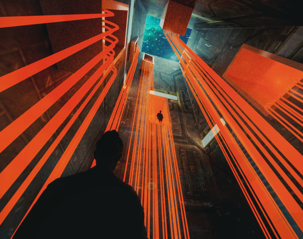
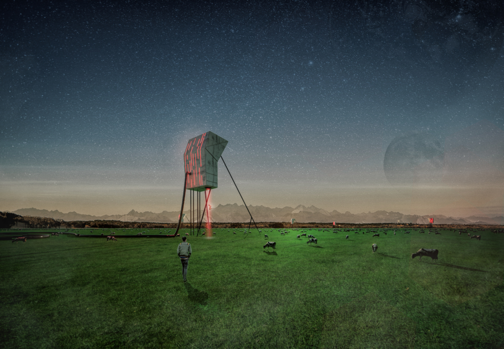
#1 The Tower
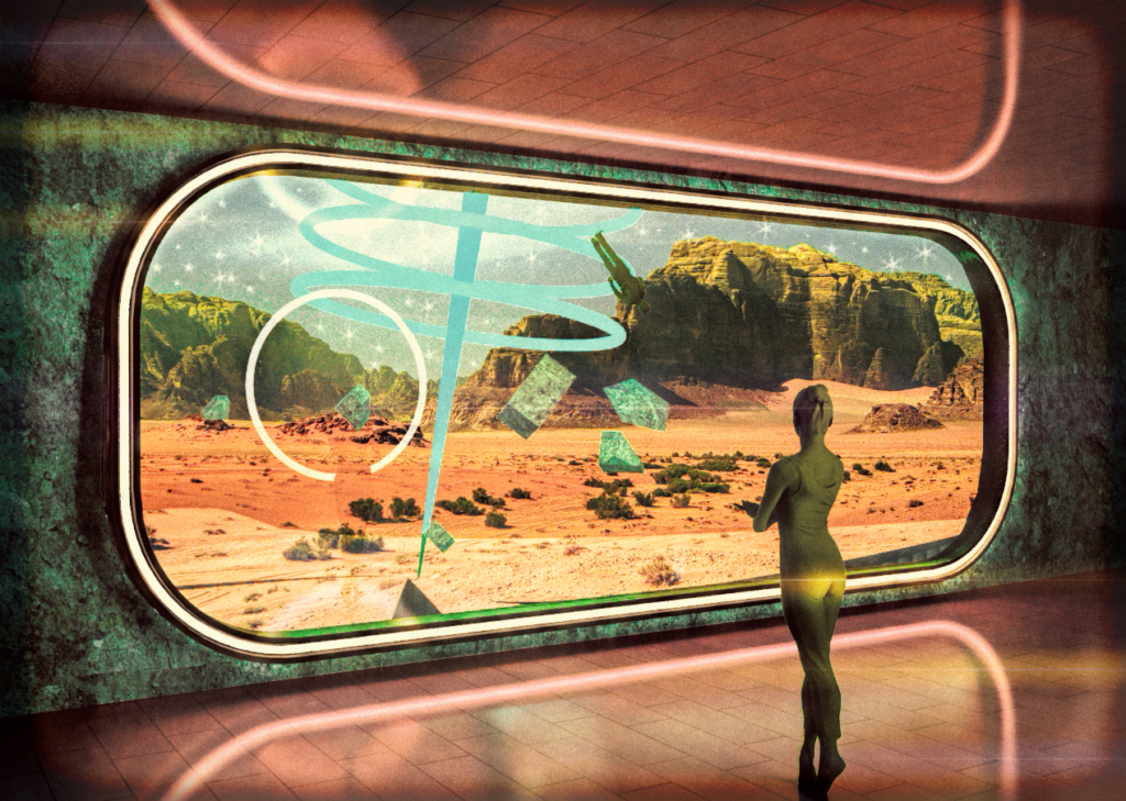
#2 The Window
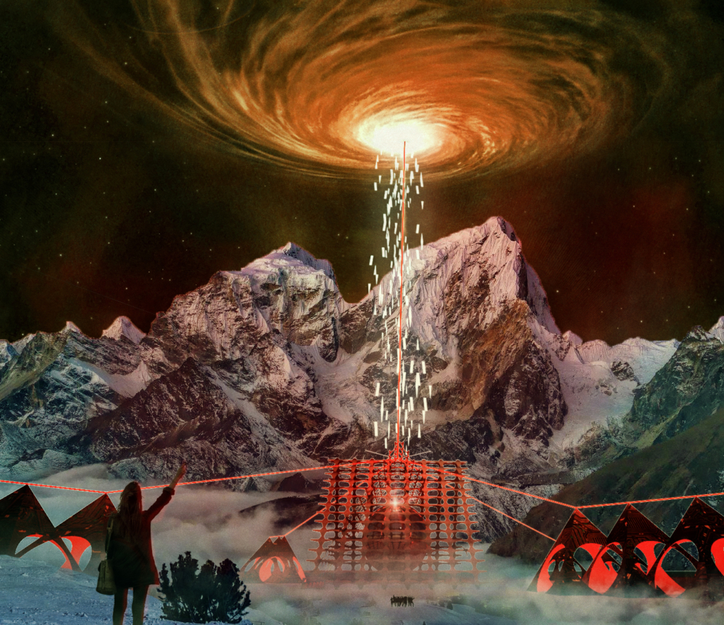
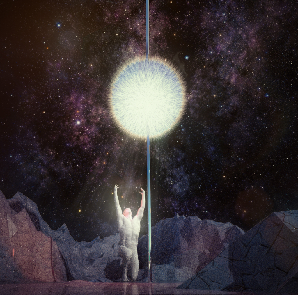
#3 The Sphere of Devine Purpose
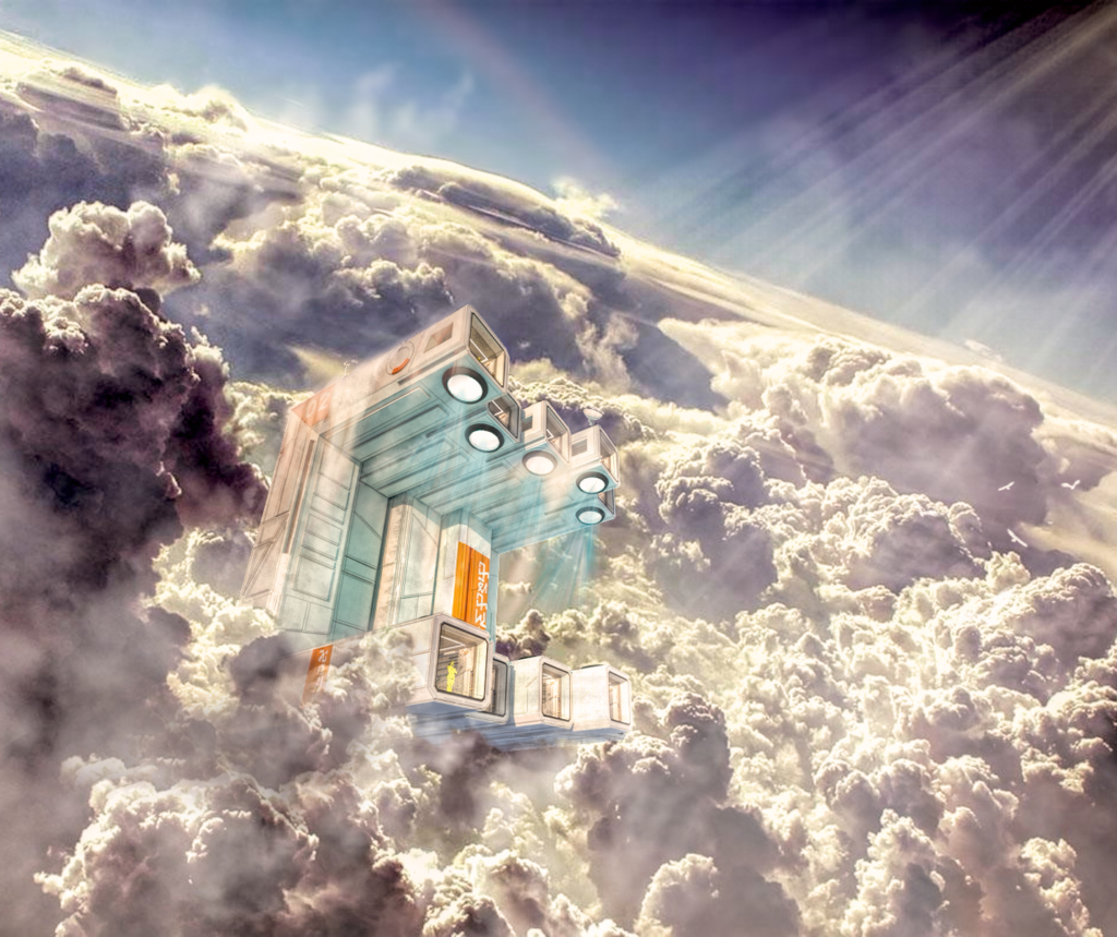
#4 Cloud Burst
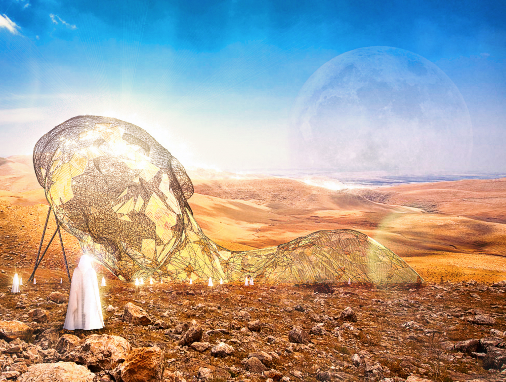
#5 Dunes
#6 Welcoming The New Year
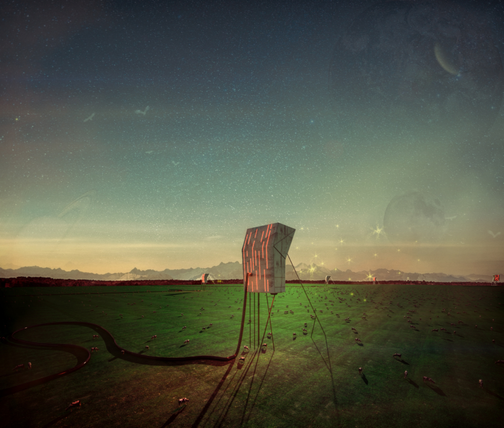
#7 Future Farmers of America
#8 Hamburger
#8 with a wider crop
I stumbled back across the “Blank Space Fairy Tales” Competition http://blankspaceproject.com/fairy-tales-2016-winners/. The premise of the competition is to write a short story (fiction) and produce 5 images that relate to that story. It is a huge competition and last year received over 1500 entries.
I thought the idea of producing fairytale images fell right in line with what I am doing with this project, but I didn’t want to write the story, luckily they let you work in teams, and my mom has been writing short stories as a hobby now for a few years. I gave my mom images #7 & #8 as a prompt to write the story, and then I will produce the rest of the images based on what she writes. So far she has a first draft done, that I have posted below. I am thinking we may need to make a couple small changes to the story to bring focus back to the architectural elements, but overall I think it is a fun story. Don’t think we have much chance of placing, the entries from previous years were really great, but still fun to have a purpose for a couple of these weird drawings. Let me know what you guys think.
Short Story
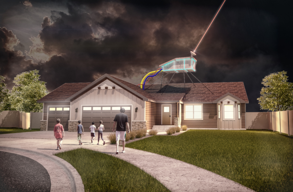
#9 Cul De Sac Parasite (this one isn’t related to the story)
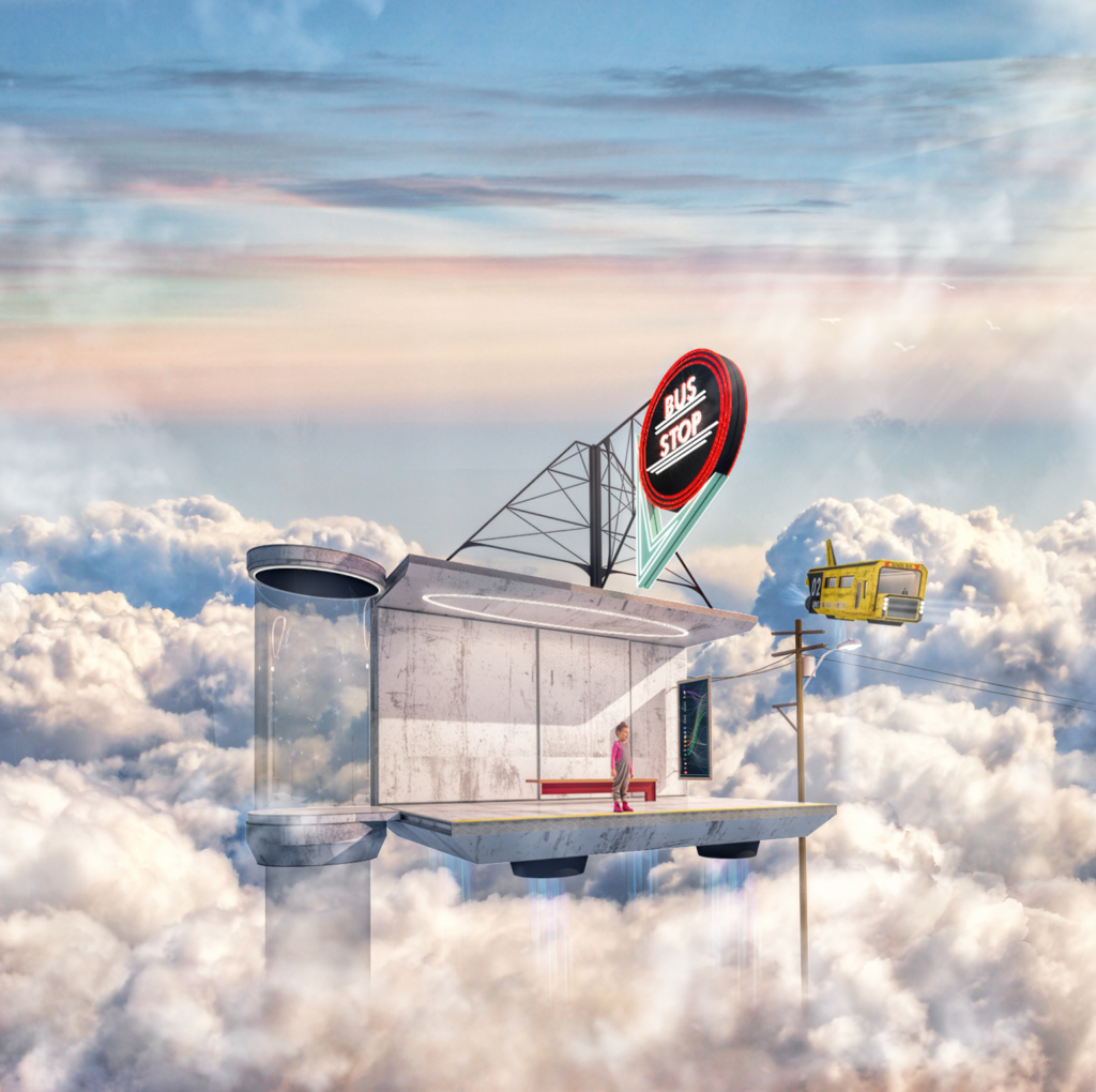
#10 The Bus Stop (This is part of the series of images relating to the story)
I re-photoshopped this one new one below
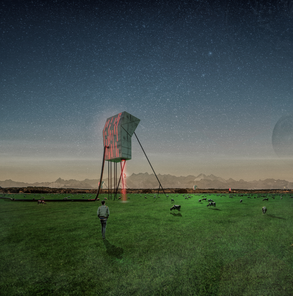
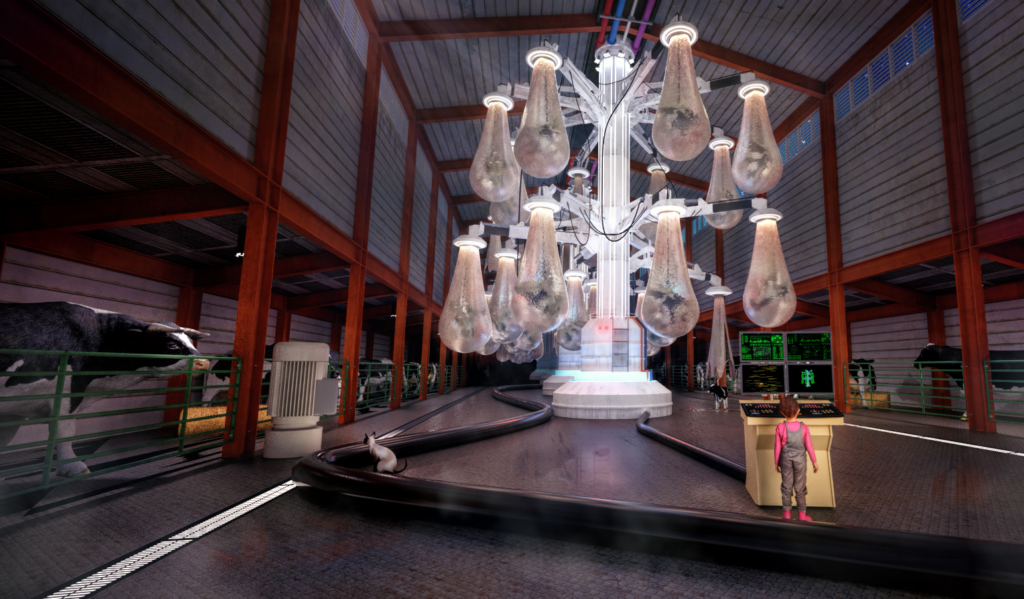
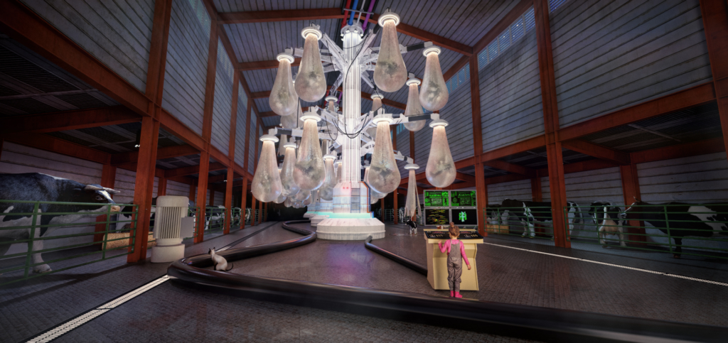
#11 Incutech – Beef development pods V 2.13 (This is part of the series of images relating to the story) I still may make some tweaks to this image
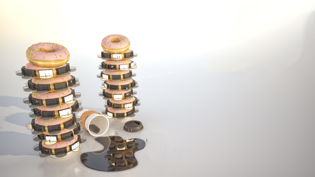
#12 Donut Estates
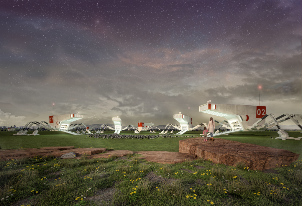
#13 The Shepards
Really fun image,
I like the composition, and the flow really takes your eye up through the piece. Isn’t it fun to use grunge textures??
Building the image was fun too I’m sure. Post up some in progress images? I’d like to see the image before you rendered it. Its honestly good practice since you are using some challenging techniques that you probably never get to use normally. When you are modeling something like this it is fun to just say to yourself, “so these openings are going to have these red tube shit pouring out of them….? yeah.”
I’m liking #2,3.
I almost want them to tell a story. once you have 12 or so you should do a fun gallery exhibition. Print them all out at 18×18 and rent out a space. throw a party and buy a bunch of carlo rossi and have fun with it.
#4 is getting really strange…
I’m not sure what gravity is doing in this one, but its pretty awesome. I might have liked the structure to be a little larger so I could see more details. Cool image, keep it coming.
I am feeling some pressure to crank these out as I want to do 16 before I have to submit my sketchbook. Not sure how I feel about #5. But I guess the whole point is just to work fast and explore lots of things. I had more time to think in my head about the first one and how it was all going to go together, I might try heading back to some darker images, I think the lighter ones are fun, but they leave a little less room for experimenting with mood.
# 5 reminds me of a scene from burning man or something. I always like the orange/blue combination, I think it balances out the image nicely.
#6 Interesting use of the grass primitive from Maxwell. I’ve noticed a lot of square proportions in these images, are you intentionally doing that, moving past the screen aspect ratio? Sometimes I forget I can alter the proportions of my images and they all get stuck at the 16:9 ratio. I’m liking the squares.
I post them all to instagram, and they look terrible wide format (bad Reason)…. also I feel like cropping during post production helps me compose a little better.
The Tall2s are looking pretty good in 7-8a. I also like the latest version of the story. It really gives the images some life, and reason. I kind of like the birds eye perspective in IMG 7 better though for some reason.
Where the hell did the model of the house come from in #9?
I really hope its one of your firms projects or something. Feather the edges of the trees out with a mask layer to get rid of that white outline on them. My eye goes right to it.
The model in #9 came from a freelance rendering project I worked on for a local homebuilder. I need to stop using those trees the way the leaves are modeled means the masks done line up perfectly with them so there are lots of edges .
My favorite part about #10 is the bus stop map to the galaxy.
How many do you plan on making for the story?
Thanks, the map was one of the last things I added. The Fairy tales competition requires you to submit exactly 5 image so I will make at least that many, but hopefully more so I can pick and choose my favorites.
I was wanting to have about 16 images to fill a sketchbook for “The Sketchbook Project” not sure if I will quite get there before the deadline. I have really been enjoying doing this so I see it as an ongoing project and hobby.
The amount of thought into the incubator is really evident. I really like the image a lot. I think its close, it still needs some lighting effects. Make that thing glow! The incubator needs to be throwing light all over the place, give me some subtle lens flares off that shit.
I think you are right about adding a few more lighting effects. I kind of think the image is maybe a little over saturated and the colors are a little all over the place…