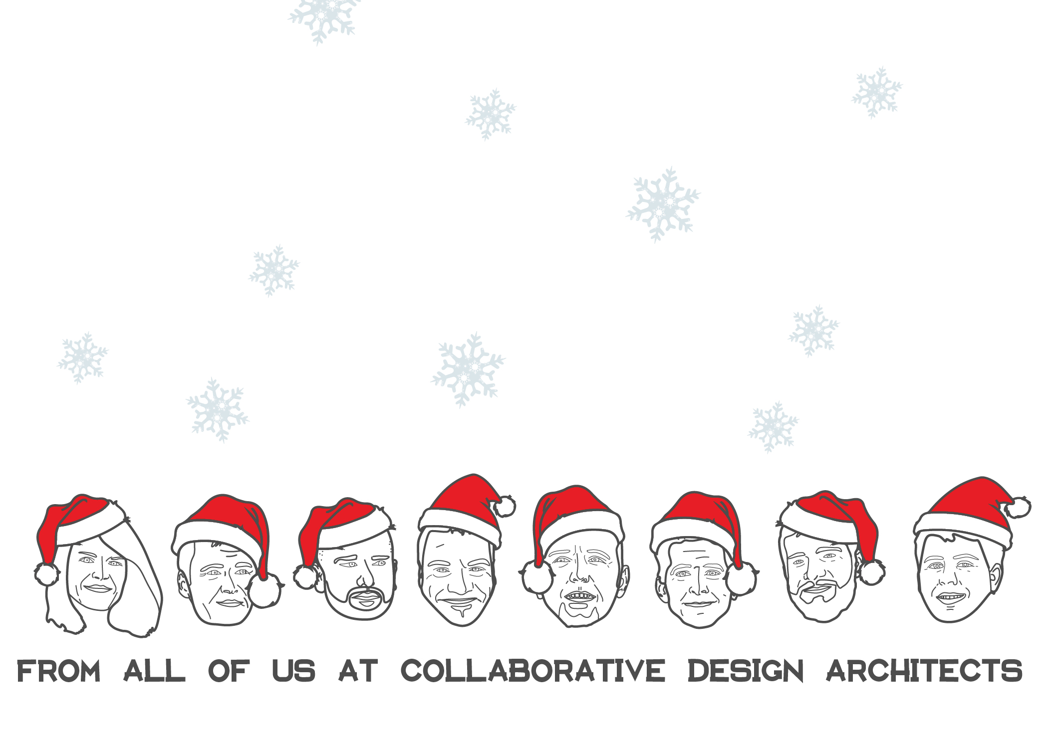
Designing the company Christmas card can be a lot of fun, and is a good opportunity to try out a few new Photoshop and illustrating techniques. The hardest part of designing a Christmas card is coming up with the initial concept. The concept should say something about the firm, be professional, but still fun, this can be quite a challenge.
Dezeen is a great resource of Christmas card ideas, every year they post the Christmas cards they receive from firms around the world. 2013, 2012, 2010
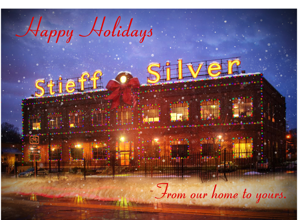
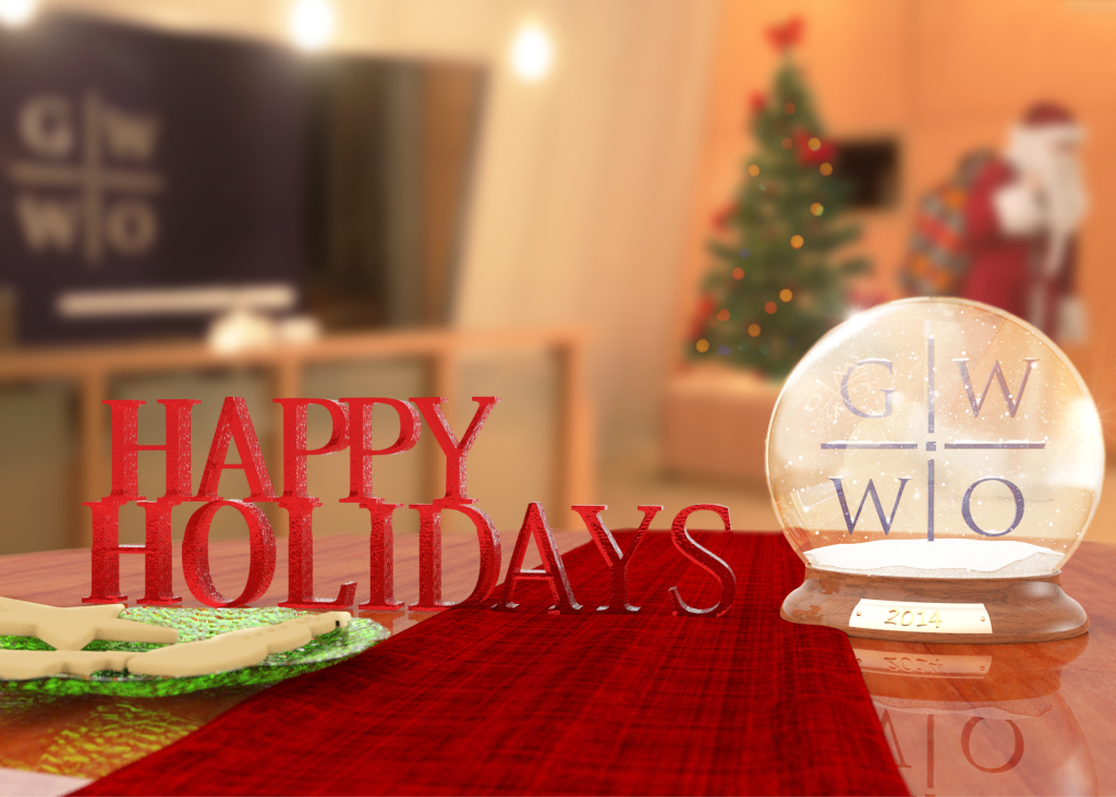
Pat and I usually send a few emails back and forth discussing Christmas cards, and I know the rest of you also usually work on Christmas cards as well so I thought I would share the cards I have done since being out of school. I would love to see the cards you guys have done, it would be great if you would add them to this post .
I am pretty happy with this years card. My firm tries to celebrate the landscape of Eastern Montana. Thinking about the vernacular architecture of Eastern Montana was my inspiration for the front cover of the card. For the inside I was able to recycle an illustration I did last year for the “Pinheads” Bowling Shirts I designed.
Card Inside
Back of Card
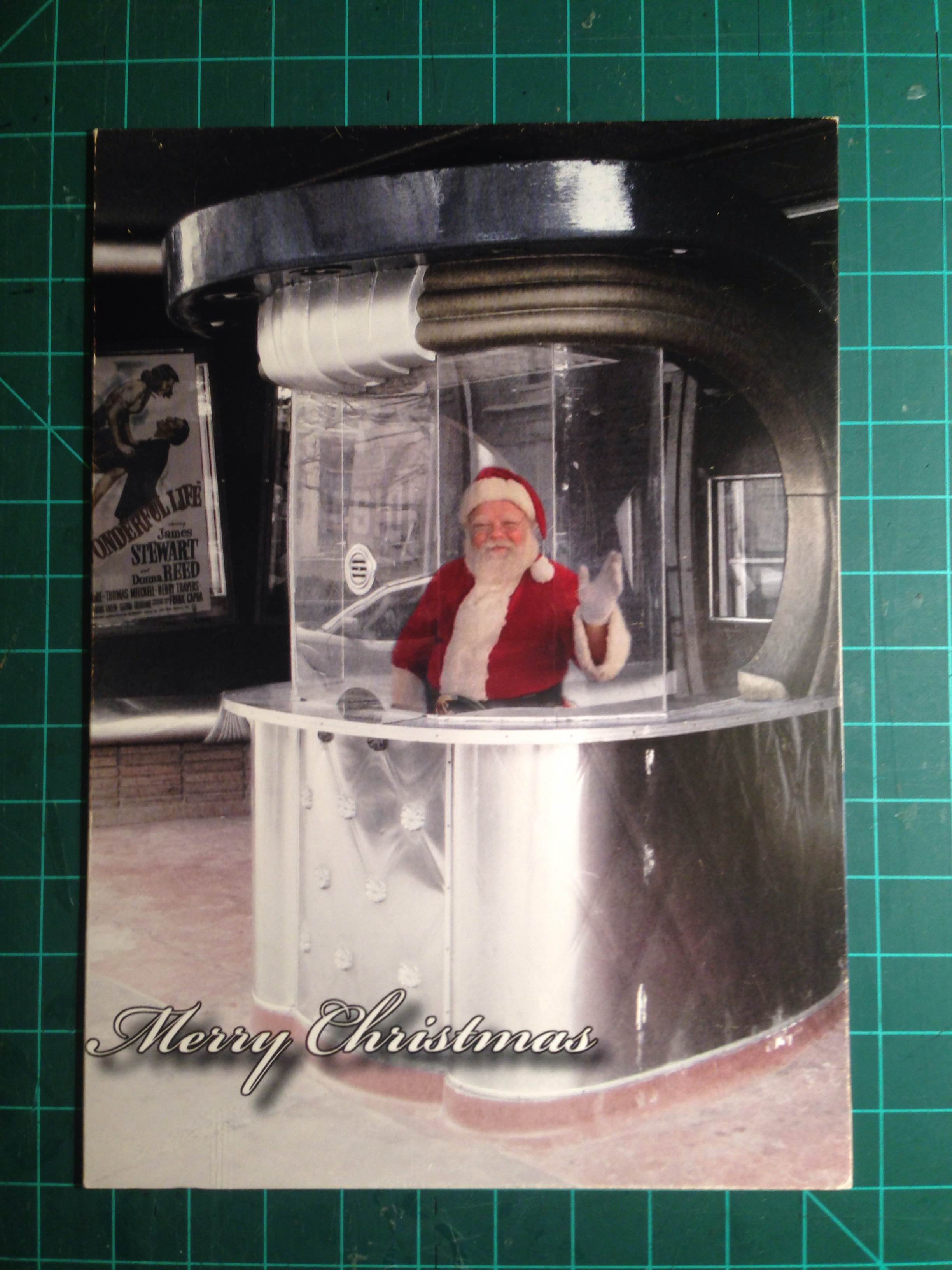
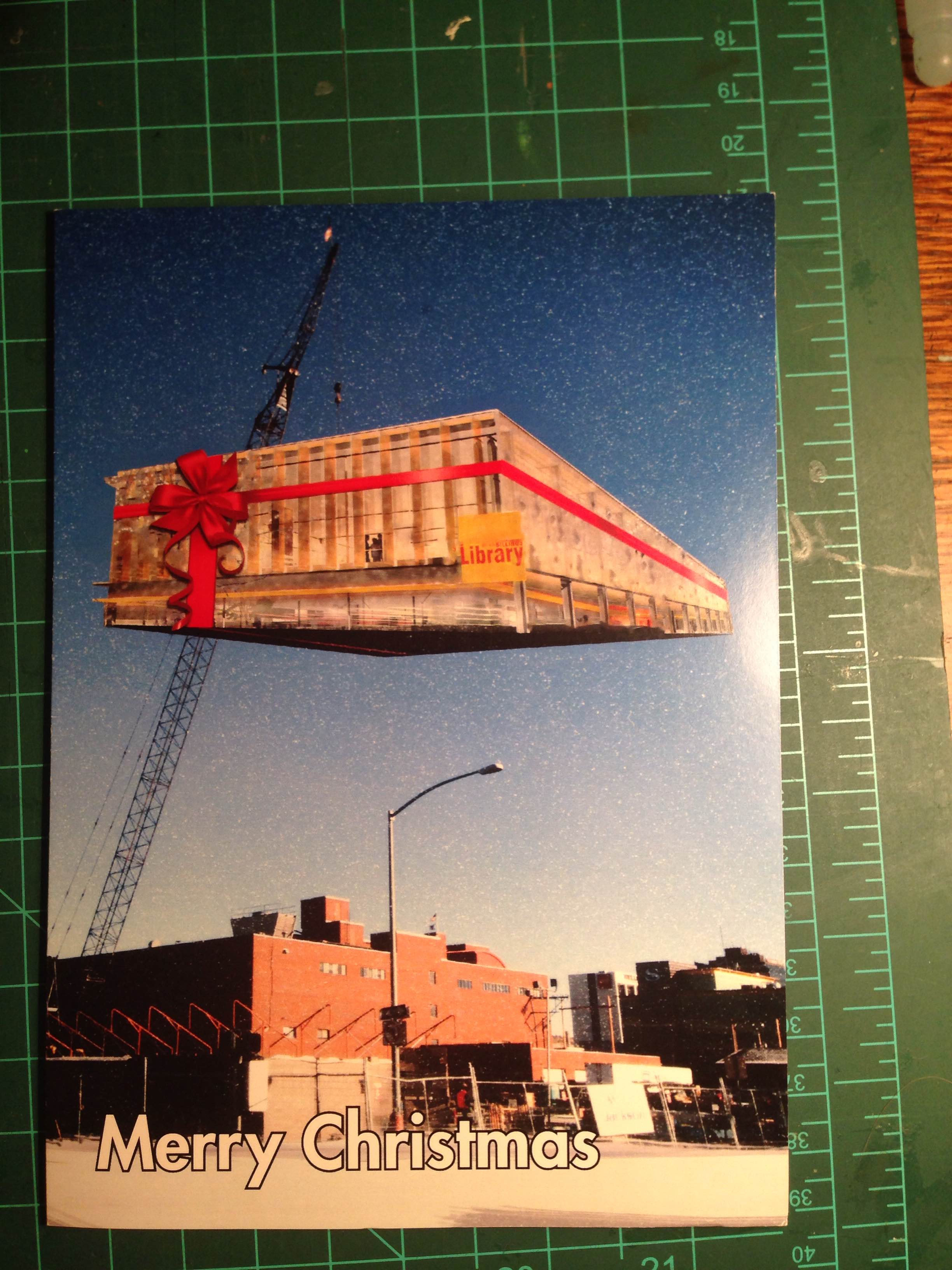
Cards From years past
My Bosses at O2 owned an old theater that they where in the process of restoring. I took a picture of the ticket booth and did some Christmas photoshoping
————————————————————————————————————————————————–
Great post logan, here are some of my christmas cards. —–Pat

