We were asked to submit a proposal for a historic renovation of a 1915 theater. The developer had acquired the adjacent 2 buildings to the historic theater and wanted to incorporate them with the new project. An architect had been working on this job for over a year, and already had renderings posted in the paper and online so it was interesting to see what was previously proposed. I think this situation is more like the developer HAD to interview 3 firms, but already picked the winner. We participated anyways, but I’m not confident we’ll get the job due to a lot of bad politics on this job. Anyways, I really wanted to make ours (design / render) look better than what the other architect released (which was actually quite good). Here is the current building. Its in an ‘up and coming’ (aka still hoodly) neighborhood in the arts district of baltimore.
Above is the existing building.
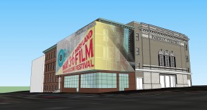
here is the other firms render.
I started throwing out a bunch of concepts in SketchUp.
Lastly the principals picked 2 options for me to further develop and render.
I think they came out looking pretty fun. Let me know if you are curious of any of the render techniques and I can go into detail about them.
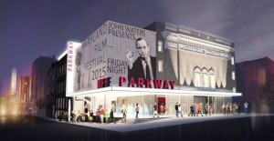
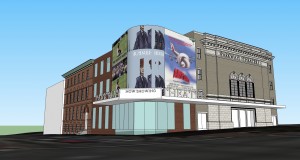
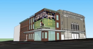

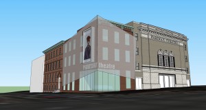

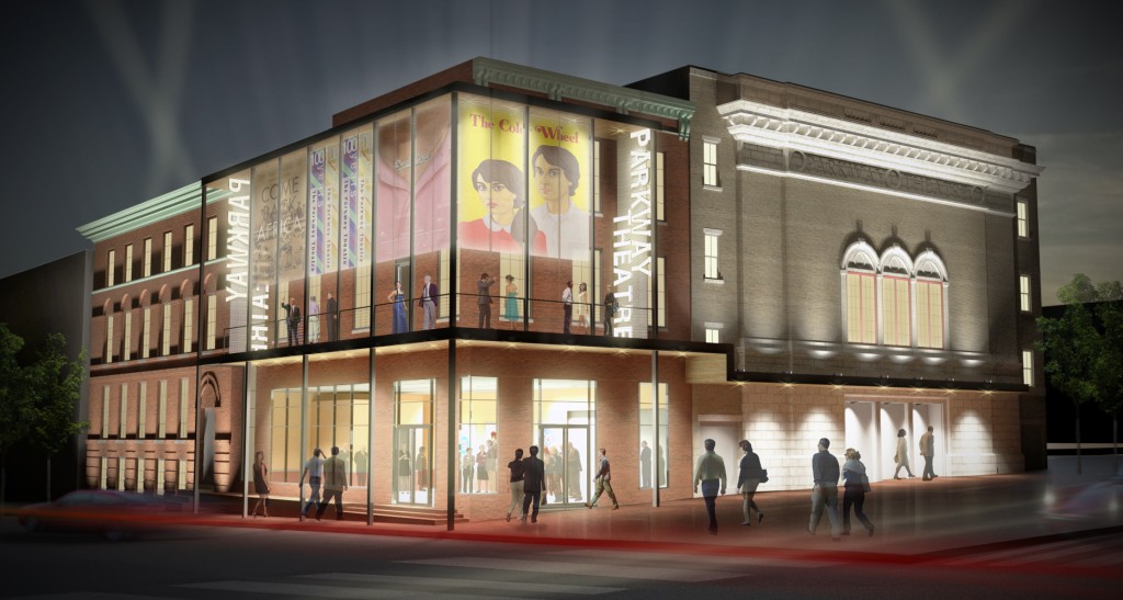
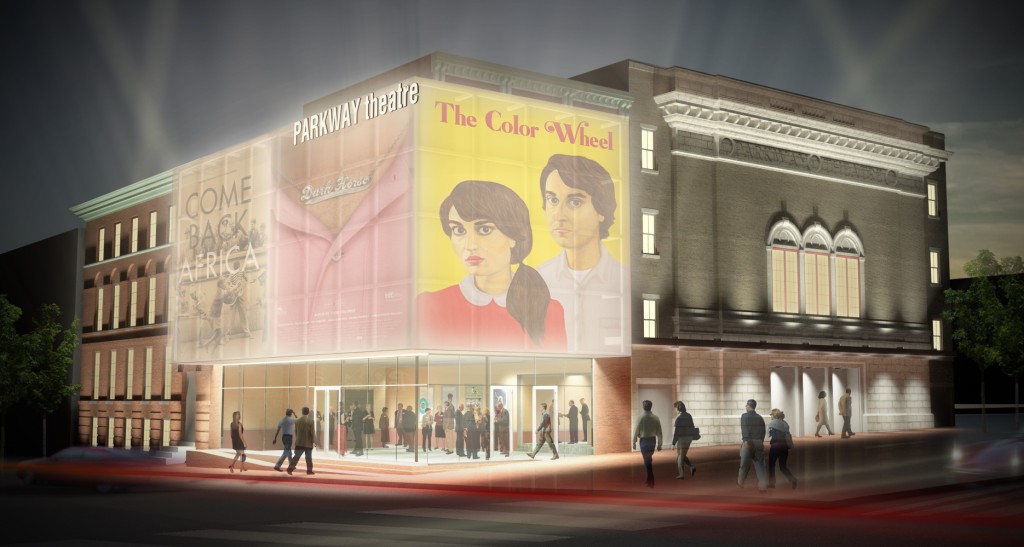
These turned out really nice, and I love the Wes Anderson References. My Favorite version is the one with the walkway, I think it would be a really nice experiance to have a drink or something out there while you wait for the movies to start. The walkway really activates the exterior of the building sort of makes a place to see people and be seen by people which for film festival things seems like a good idea, and it informs the neighbor hood about what is going on at the theatre. I didn’t like how the other firm totally covered the facade of the one building, I like in your walkway scheme you pull everything off the front saving the old facade and and still allowing people to interact with it, and getting the new stuff out at walkway level still gives it a more modern updated look. Good work this is one for the portfolio!
Thanks man, I really liked that scheme as well.
Unfortunately, I heard yesterday that we did not get the job. Somethings are just too political I guess. After the principals interviewed for the job, they said If they didn’t know about all the behind the scenes foul play, they felt really good about the job. I guess some times the best scheme / idea doesn’t win.