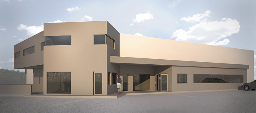
We are doing a project in a town outside of Whitehorse for a new Subway restaurant with two apartment units above. The project will be an addition to an existing Super A store and the client wants to revitalize the entry to the building. I was asked to to some renderings for the client and had about a day and a half to model, render, and photoshop. I modeled using Sketchup for these ones and the Maxwell plugin which mysteriously decided to start working again on my work computer. I was asked to show only massing with possible fenestration, no materials or branding.

Looks interesting, but I think its a silly request to not show any of the signage. That is such a huge part of wayfinding / entry / identity. Interested to see where this project goes.
I think you got some odd instructions for this one, not sure why they didn’t want any of the signage or stuff that will all eventually be part of the final design. That said I think you could have been more diagrammatic, and less photo realistic with these images. The lack of certain details makes the photo realism feel odd and out of place, it is like the building is in it’s final concrete stages. I think something much looser possibly even some hand sketch type thing would have been more appropriate for this application, even just doing everything in white with a few color overlays might have been fun. The realistic looking pavement, people, and cars are just a bit much for this one. It would be nice to see this as it progresses and gets to a more detailed stage.
From a material stand point your glass turned out great, I have been struggling with glass lately, what material are you using or it is something else you came up with?