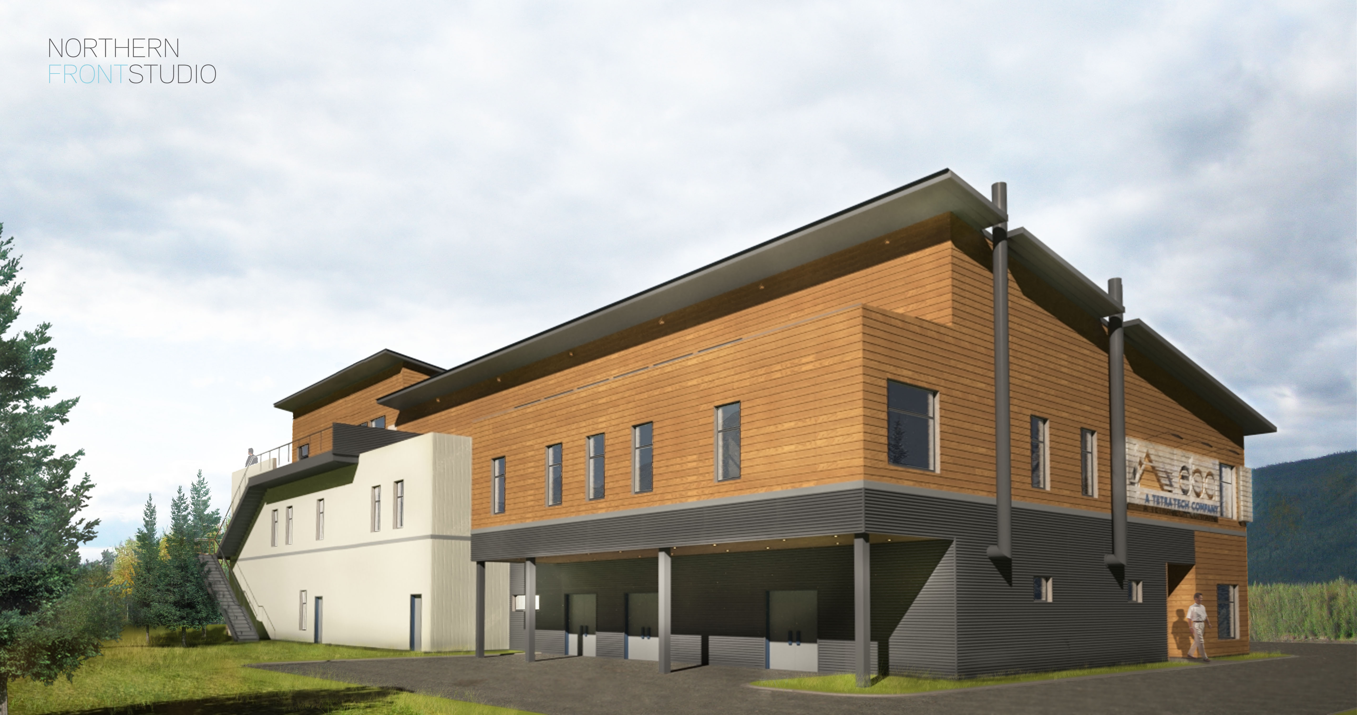
So over the course of a couple months I have been working on this EBA project to varying degrees. In the last week it heated up again as more talks started up again about the signage, blocking for the signage, corporate branding etc. I did two renderings in a day for the client for him to show his superiors to help visualize the signage and so they could sign off on it (ha!). I was pretty happy with them for only a days work but really only had to model the signs again in their new positions and do a little post processing after letting them render for about an hour as I had most of the building already modeled for the other renderings I’ve been working on for our website.
The above images were the ones I did the the client to visualize the signage. 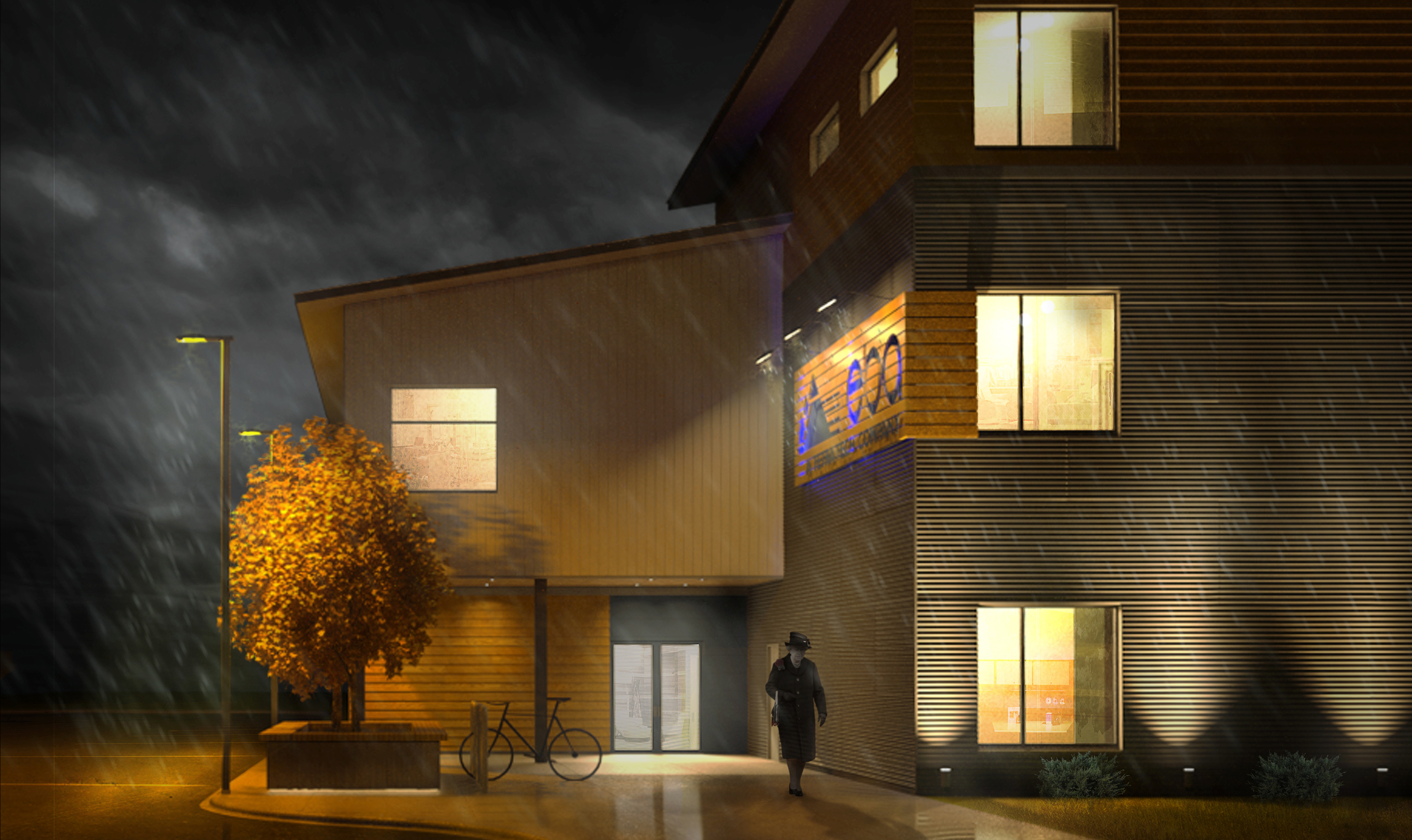
This image was one that I did a while ago after watching the shipyard rending video that Logan posted. There was a lot of photoshop work that went into this one.
In the end, I ended up turning off the rain because my boss said there was too much misery.
The last image I did was of my favorite side of the building but I received a lot of comments on all of these for not being real enough. I found this frustrating. To me, the purpose of doing computer renderings is to present the ideal form of the vision of the project. The site is a mess, full of construction equipment and crowded. It might be an excuse but it might also be my desire to make the building look as best as I can image it, complete with extra lights and trees and queens. To me, this makes things look better and would sell a project and would look best on a website; better than the reality of money crunching and chain link fences.
Now I just need a couple squirrels
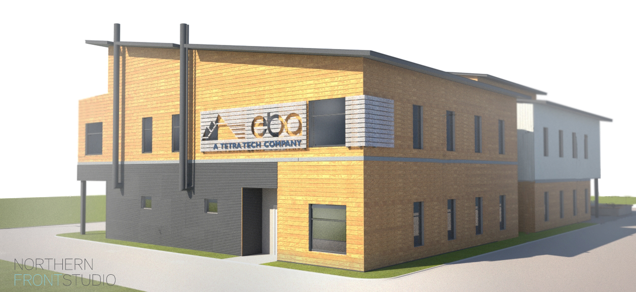
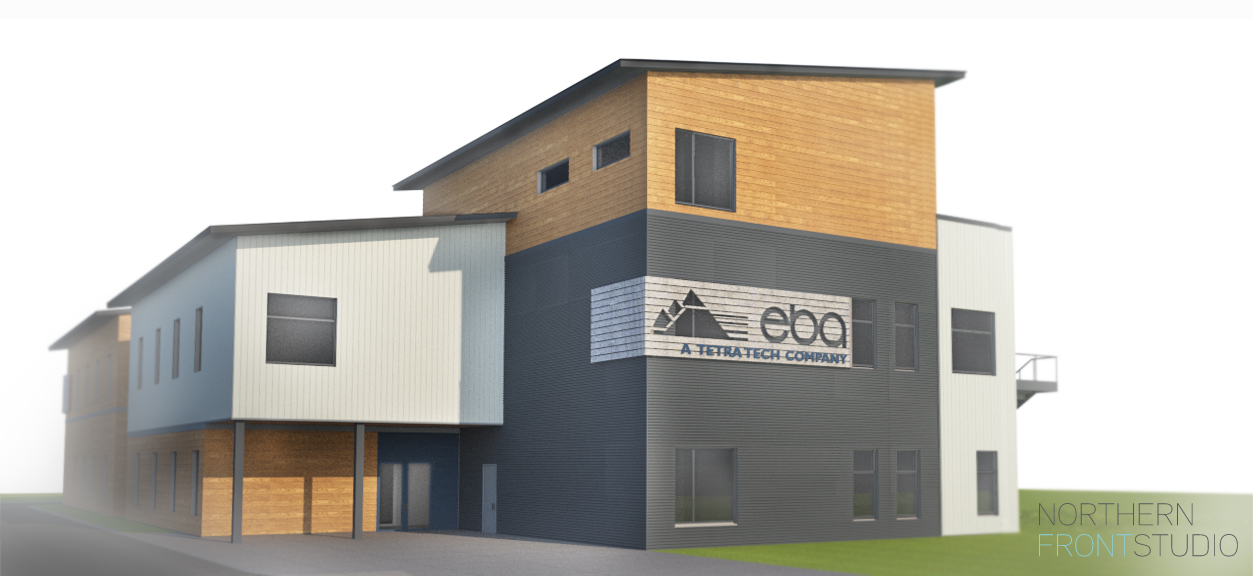
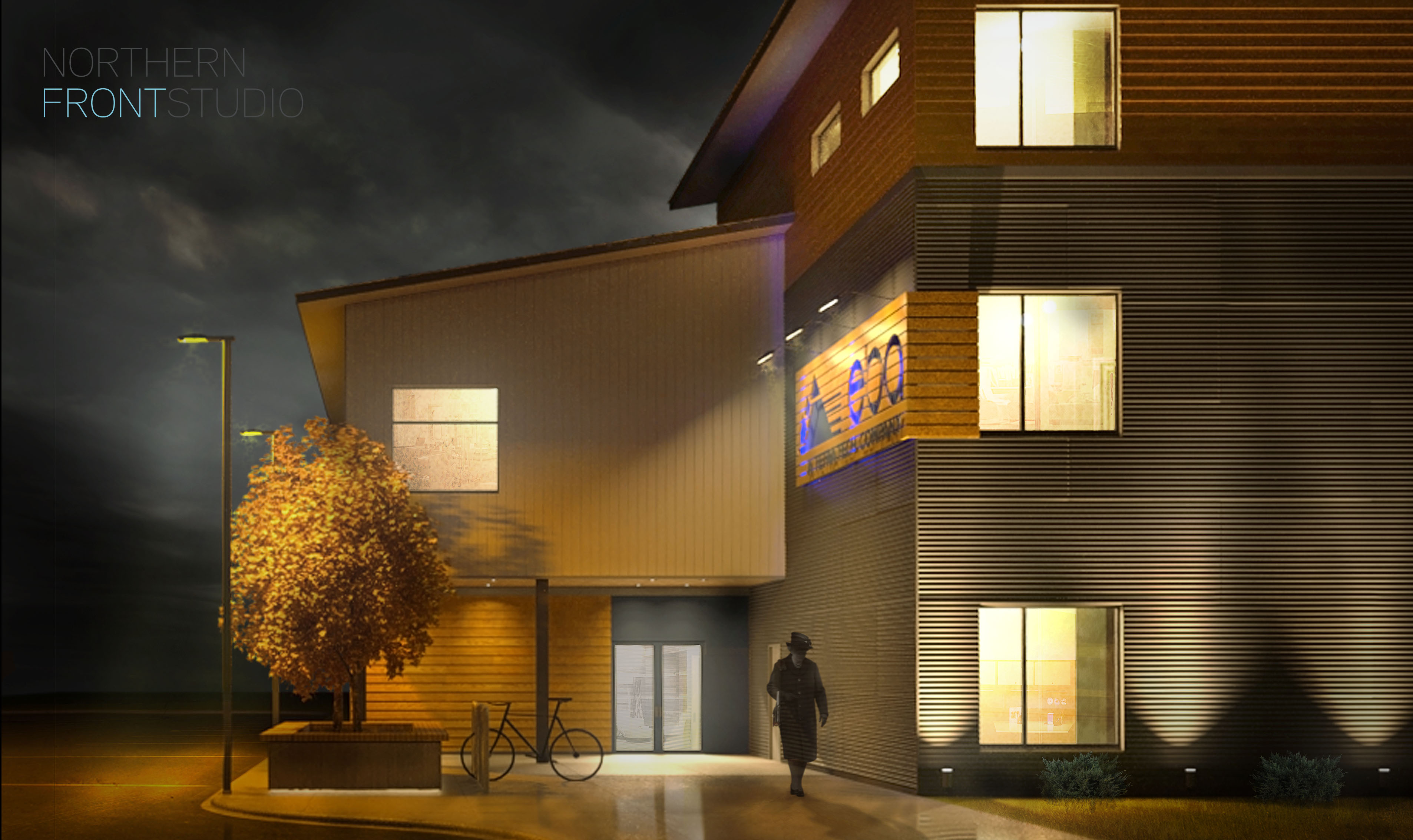
These renders look great,
When you say not realistic, I guess they are referring to it out of its true context? Because the renders them selves are pushing quite a bit of realism I’d argue. It would be silly to put in and model (or Photoshop) the crap on the site. You are thinking correctly when you talk about making this render look as good as you can. At the end of the day this is an “Artistic Rendition” of a project. As an artist, you can do what you want to make things look great. I screw up landscape plans all the time because the amount of trees called for would hide my building, so I just leave them out and such. While the client/boss is always right, always try to push your agenda of making the best possible image/ project.
I think these images all look great and give you a ton of information about the building. I really don’t think your office has much room to complain. I think it is important to be accurate whenever possible, but we all my adjustments or “fake” a few things for the sake of the final image, hiding the bad and emphasizing the good. These are really your artistic impressions of the buildings and I think you are well with in your rights to make a few changes for the good of the image. These all look really great, and will be a good addition to your portfolio.