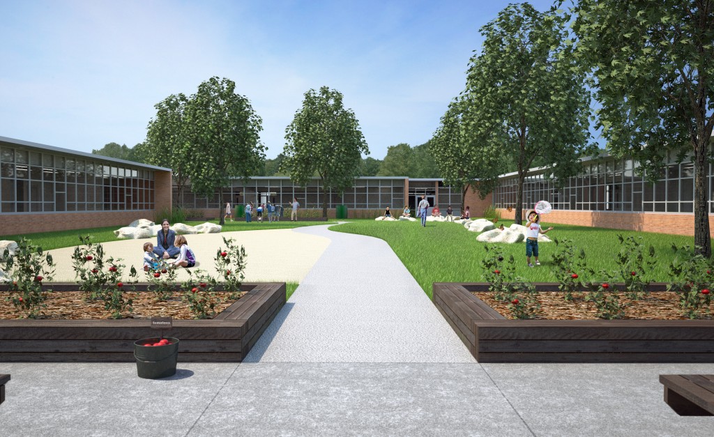
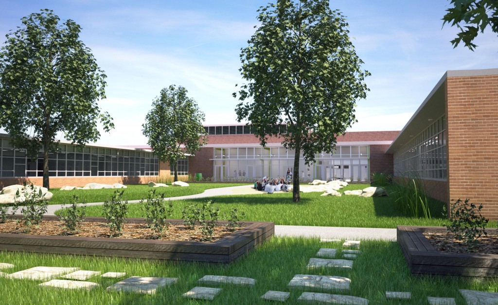
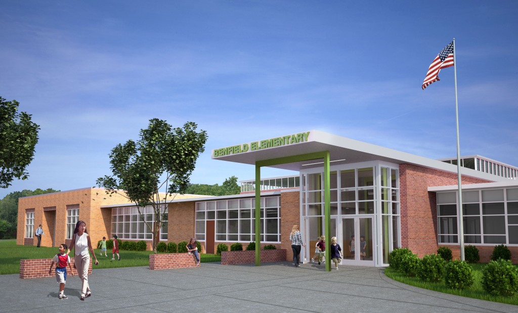
I was asked to do some renderings of this elementary school modernization project that were are building in Maryland. The project consist of creating a courtyard, new entry and main spine of the project, and a new gym. Typically my renderings consist of about 60% maxwell/model work, and the remaining work done in Photoshop. Lately, I have been wanting to get those numbers to be more like 90% render output and 10% photoshop. There are several reasons for that, If you need several renderings of the same project, all the time spent in the render files can be applied to all of your scenes. Otherwise you are stuck photoshopping the same elements into each scene. Also, photoshopping is difficult. Its hard to blend realistic photos, and GC work.
The Process for these renders is as follows: I was handed a pretty complete Revit file. I then exported to ACIS Solids, This makes things solids in rhino and not dirty meshes we all hate. Then inported to rhino. I found these trees online somewhere. Somebody had made them in rhino. I have had troubles importing models that were created in sketchup or 3Ds. Then Rendered in maxwell. Each rendering I let go overnight. So the average time was 12-14 hours. As far as the grass goes, I am using maxwell 2.7.0. They have this new grass plugin, and you basically can describe how many blades you want in a square meter, and how much you want them to bend and such. In the courtyard renders, there is some tall grass.
For the skys, I am using HDRI images. That is a 360 sky you place in your model. You can also use it for illumination but I have not figured out how to get crisp shadows, so I am using it on the background and reflection channels only.
What are your thoughts?
p.s. its my first post, so sorry if I attached or formatted this incorrectly.


These are looking super professorial ! I am loving how clean everything is, it is all very sharp. I think the new Maxwell grass looks great ! Not completely sold on using the grass tool for the tall grass, I am guessing you guys are planting Karl Forester or something like that, and you maybe could have found a model for that that would have been slightly more convincing. I think these three images are really impressive and really kind of takes things to the next level…. keep chasing that 7th and the 3rd quality !
Thanks for the kind words. Yes, the Karl Forester ( I was unaware of that name) is exactly what I will be going for in the next rendition of these renders. They are still works in progress. There is also a media center interior I will be doing as a part of this set. but I have not begun it yet.
These look really nice. Reflections, lighting, and shadows all look very convincing. The one thing that I would point out is the repetition of the brick pattern as is repeats over longer walls. This is a problem I have always had in making my images look more real. Some materials seem to scale better than others. Is there a method anybody uses to fix this through rendering or Photoshop? Usually I end up photoshopping a bit of dirtiness and imperfection into a repetitious wall to help to keep the distraction of the repeating pattern down, but as you said, that takes time.
Thanks Steve,
Yes, The bricks look great if you have a wall facing you, but if that wall is going back to the vanishing points, It tiles badly. When you say that you PS dirtiness to it, do you mean a masked or blended layer? I have in the past used the clone stamp to break it up, but since the material gets smaller as it goes back, this can be ineffective.
Usually I will add another layer on top of the repeating pattern that when used as an overlay helps to break up the pattern as it vanishes. As the pattern gets closer to vanishing, I leave more of the layer intact but where the pattern is closer to the camera, I will erase it and let the material take precedent. After that it seems like I’ll spend a lot of time tweaking and using the clone stamp or other tools which is why I was asking if anyone had another method because sometimes it seems like a lot to do for only a little effect.
The other thing I have done is to actually create the brick, or piece of wood etc.(or a small group of them), get the tiling perfect for that piece and then array it in groups to create the wall or facade. Most of the time this ends up being a lot of extra work, but sometimes it is worth it. Once the object is arrayed, you can randomly select groups along the wall, group them in rhino, and then push and pull them to get that little bit of imperfection and variation that is present in most assemblies. By grouping, you can also apply materials on different channels or positions for each group, to break things up more. For me, this and similar detailing has become what Pat was talking about when referring to having a perfect model or spending more time in photoshop.
Also Pat, do you find that including the trees really increases your render time? What kind of objects are they? I included a tree once and my computer hated it. Also the grass and the way it makes shadows looks really great; I’m going to have to try out that plugin. For your sidewalk detailing, did you do that in photoshop or rhino? It really looks nice and again, helps break up a large surface.