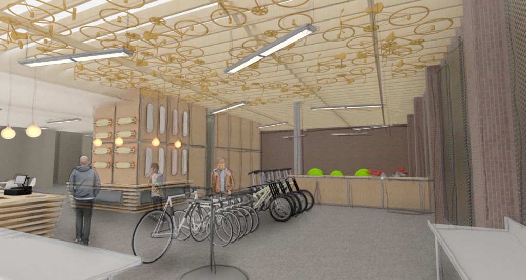
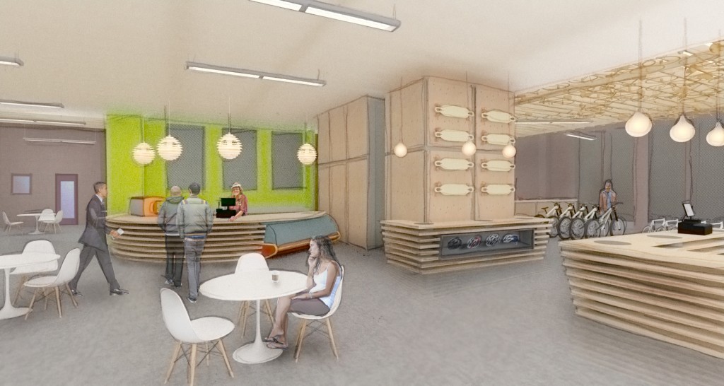
Here are a couple of the first rendering I did when I started at O2. The building is mixed use and at the time of the renderings the intent was for it to contain a bike shop, coffee shop, and a law office. I added a hand drawn layer for a little extra Style. Let me know what you think.

I want to sit at the table with the cutie. We can talk about cell phones…
How did you propose that you do these images? It would be fun if I got to do these types of things more often. It kinda looks like some things are floating. Not sure how to fix that, maybe more photoshop, less contrast? I think it is hard to ground things on a uniform surface, maybe if there was more variation in the concrete floor or overall lighting of the space? That’s my only criticism, otherwise looks good and I’m sure was fun to do.
I think things look like they are floating, because of the reflection I added to the concrete floor. I did that intentionally….however, it may not have been super successful. I was wondering about it myself when I posted these
I like the hand overlay. Personally, I think its just a little too loose for me, but if the bosses liked it than it was very successful.
Also, when I do a hand overlay, I typically only draw the architecture, and not the people.any reason why you chose to highlight the figures? All in all, the exterior is super fun! its my favorite of the set. You really see the building.
The exterior is the only one without a hand overlay. Also worth mentioning in the interest of full disclosure, I did the exterior rendering, but had really nothing to do with the exterior design that was all my co-worker Chris.